Quantcast
Channel: stuff that makes my heart beat faster
Viewing all 68 articles
Browse latest View live

Eight Norwegians and a Finn

$
0
0
There hasn't been much time for thrifting lately, and I haven't been very active on the blogging front. I hope some of you are still around... The process of taking over the company I work for has drained me, we also have an huge amount of projects, big and small. Which is good. I guess.....Still, being creative and innovative when there's so much on your plate is not always easy.

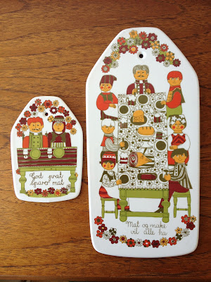
I finally managed to pop by a couple of thrift stores this Saturday and found some nice pieces. Apart from Figgjo and Stavangerflint, both brands from my home town, I love Egersund fajance, as I'm sure you've noticed:-) What I find particularly interesting is that the factory produced for such a long time and covered a broad spectre of periods. The pieces I found on saturday represent two of them, the 70s and the 30s.

I'm falling deeper and deeper in love with Unique, their eggyolk colored design from the early seventies. I adore the cheerful, shiny 70s vibe and the handpainted touches. I find both the colors and shapes to be so very typical for that decade of bright colors and great graphics. Unique was designed by Kaare Block Johansen in 1971 and was in production until 1976, just a few years before Egersund Fajance closed down in 1979.  I've found quite a lot of these by now, and use them daily, mixed with Korulen. You can see the amazing teapot and cups in my previous post and find more information about both Unique and it's "sibling" Korulen here and here. This time I found two large serving dishes and a lidded sugar bowl, all in mint condition.


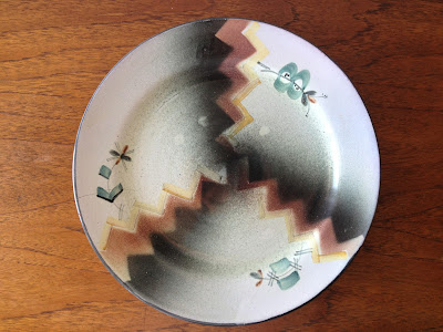
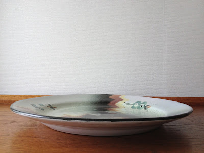
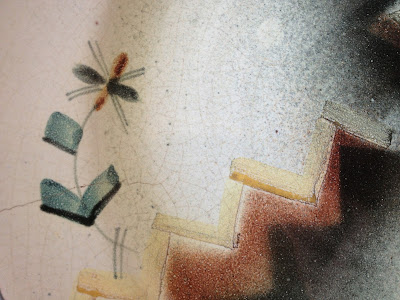
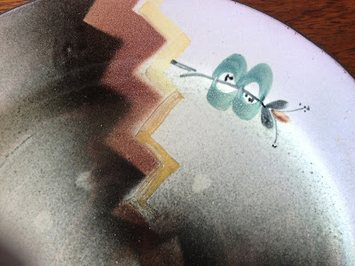
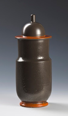
The factory made some rather lovely art deco pieces, this latest one I've found has a pattern which is very typical for that era. I have a few more art deco pieces by Egersund fajance, but sadly have not been able to find out anything about the artists behind them. 


I found this large and lovely Cathrineholm casserole in a design which is not so common. It may be inspired by the Finel mushrooms, or the other way around, I don't know which came first. The pattern is in a deep, muted green and the greyish white background has a hint of green. It's in great shape and the best part-  I got it for next to nothing, 75 kroner (equivalent to 12 USD or 9 euros)!!


A while ago, I found some Stavangerflint "Mesterkokken" ("Chef") dishes in reddish brown, yellow and teal, designed, silkscreened and handcolored by Inger Waage. This Saturday, I found three plates in the blue version of the design. I don't have much blue in my home, but I couldn't resist these. The pattern and color of these blue ones makes me think of Delft, I wonder if she was inspired by their lovely designs? "Mesterkokken" was introduced around 1960, I haven't been able to pinpoint the exact year. One of the dishes I found the last time originally had a lid, but as is often the case with vintage lids, they've gone missing years ago. I've seen in old ads, though, that both color combos had brown lids. See my previous post on this design here.


I'll leave you with my most cheerful find this time, this gorgeous Arabia Finel enamel pot, designed by Kaj Franck. The pattern is by Esteri Tomula, a great graphic designer from Finland who is the woman behind numerous  amazing Arabia designs.


The latest

$
0
0
Last week my oldest son had a football cup quite some distance from where we live. The team stayed in a school, and most parents went there over the weekend to see the games. NOT in sleeping bags in that school, I can assure you!!) My son broke his arm during a match two weeks ago, so he basically went along for the fun bits and to hang out with his team. My interest in football only go that far, so without the pleasure of watching my son play, I decided to sneak away for an hour to a nearby charity store I'd noticed on our way there. It was HUGE! Some of this weeks finds are from that store, like this first one:

This is a large Figgjo Folklore wall plaque. I found it in a charity store at around half of what the usually sell for. I have a smaller one that belonged to my grandmother. A while ago my mum gave me her Folklore set, you can see it here. Folklore was in production freom 1970- 75, and was designed by the amazing Turi Gramstad Oliver. I love the cheerful summer scenes, such a happy pattern!


Seeing them both side by side shows you how big the new one is, it's a whopping 33 centimeters tall!


Then three great, and VERY different vases. I found this tall and amazing Carstens vase in the same store as the Figgjo. Isn't it gorgeous? I so love the textured surface and the color! The pattern reminds me a bit of Einar Johansen's designs for Søholm, don't you agree?


Speaking of vases, this beautiful bisque vase is Suvi by Arabia. It was designed in 1981 by Gunvor Olin-Grönqvist, you can see her initials "GOG" in the last picture. It has a molded relief of flowers, which stands out on the unglazed surface. Suvi is a whole series of vases in different sizes and really nice planters. There might also be more products, does anybody know?
My mum has the bigger brother (sister?) of this one. She bought it in the early 80s when she got what my dad later refers to as the most expensive bouquet he has ever given her. She received a large bouquet of roses from Amsterdam and he didn't mean the price of the flowers, but the fact that she didn't have a vase that was big enough and went out and got a really large Arabia!


The third vase is a Scheurich. Seems a shame that I never write anything about the Scheurich pieces, it's simply because I don't know a great deal about them- other than the fact that they're gorgeous! Love the colors and lava pattern on this one.


My collection of Stavangerflint souvenir plates from my home town is expanding, I found two new ones yesterday. I'm not sure who designed the ones with the maps. If you look closely, it says "Viste" just to the left of the Stavanger cathedral, that's where I grew up and where my parents still live! To the south you see Egersund, home of all that great pottery, and in between is Jæren, with my beloved beaches and rocky shores. 


The second one in red is handpainted by Kari Nyquist. It shows, like my previous plates, scenes from my home town. This was made as a corporate gift (that's the text on the back), it even states the year, 1964. You probably recognize the scenes and buildings by now, after I've been going on about it several times:-) Notice the fish monger in the third picture trying to impress the lady? You can see my other ones here.


Today, I found six more settings in the Stavangerflint Finse pattern, as well as a sugerbowl and creamer and egg cups. Finse was designed by Kåre Berven Fjeldsaa in the 60s. There is more information about it and better pictures in one of my recent posts.


I've been on the lookout for egg cups, and lately they have been pouring down on me:-) I especially love the Figgjo ones with the little bowl for egg shells, that you can see here, but the Stavangerflint ones are also really cute. I found eight Finse egg cups, and four Sera. I think the egg cups look REALLY good in Sera.


I found a small Knabstrup dish and candle holder in a very delicate combination of light greyish blue and beige. The colors on the dish are more faded. I don't know a great deal about this company, and found this information on this site that sums up their history:

This factory was based in Denmark in Zealand.  From 1856-1907 Knabstrup Lervarefabrik was a brick factory. In 1897 it was bought by Henrik Schou and in 1907 its new ceramics factory formed the basis for a new era in Knabstrups history. 
In 1930, production was mostly utility ware. Aksel Sigvald Nielsen (Aksini) worked there until 1954, producing vases and also pottery plaques. After Frida Schou retired as Director in 1970, the factory bought a new gas kiln, Bjorn Wiinblad took over production and changed the name in 1977 to Knabstrup Ceramic Factory A / S. Production consisted of dinnerware, wall plaques, and dishes. The company closed in 1989.

There's a pair of candle holders in brown and green for sale in Birgitte's Etsy shop, have a look!


That's all I guess! Well, that's not excactly true. I found something really sunny that I decided deserves a post of it's own. If you're on Instagram, you've probably seen it:-) See you soon!

Surf's up!

$
0
0
Italy was amazing. There´s no end to all the beauty, but my home town on the Jæren coast is my paradise. It´s where my heart is, and I miss living there so much it´s almost painful to visit. Not to mention leaving it again...

I took my kids surfing a few days ago. There are 70 kilometres of gorgeous, wide, white sandy beaches in an almost continuous belt. The rough North sea sends waves crashing into shore, which makes the area a mecca for surfers year around. There´s also a lot of kiting and windsurfing going on. Notice sunbathers on the beach? That´s right, there aren´t many! It wasn't cold, but very windy. Those who ventured out that day, stayed behind the dunes where the local microclimate is sheltered and warm. I actually enjoy this climate. I wouldn´t mind if it was a little bit warmer in the summer, but the winters are mild (and often wet), not like the freezing cold, snowy ones that´s more common in Norway. When most of the country gets snow, Jæren gets rain. The landscape outside Stavanger and Sandnes is flat and very fertile farmland, and due to the mild climate, the very first potatoes in the spring comes from this area. 

The beaches are not only used in the summer, but year around. Walks here in the winter is great, that´s when the biggest waves roll in. During Easter there´s the traditional boiling of Easter eggs typical for this area, where people bring firewood and and find a nice spot between the dunes to boil the eggs with some onions to make them nice and yellow. The rest of the country goes skiing...


The two dudes flanking the group are mine. The one on the left is the little thrifter:-)


Carrying the boards across the steep dunes after we're done is not the most popular task of the day.... I can't believe I didn't get any pics of them actually standing on the boards, but then again, I'd have to be real quick:-)

Dune architecture

$
0
0
If you read my last post, this is what's behind that belt of sanddunes. When you cross the dunes you leave the windswept beach and enter a sheltered green area where you can still smell the salty North sea, but also an intense smell of grass and straw, and there's the chirping and humming of birds and insects.

I wanna show you a piece of great design and an outstanding piece of well adjusted architecture. I never thought I could fall in love with bicycle parking, but this one is something else. Inspired by the straw growing in the dunes, it looks like a great abstract scupture. Not so sure about the functionality, though, but I tend to choose beauty over it. It was a project for Jæren Friluftsråd (not sure how to translate that, but it's an organization that is responsible for the preservation of the Jæren landscape), and I know you can find them on two other beaches, maybe more.


This particular piece of great design is located in the area behind the dunes to accomodate beachwalkers arriving by bike. On one of the most beautiful of the Jæren beaches, it's situated in the opposite end from where my aunt has a small cabin, which I wrote about in this post.  

The dunes are in constant movement. In the 1800s, many farms were endangered by sand being blown over the fields. A belt of straw was planted to keep the sand in place and this caused large dunes to build up. Today, the area behind the dunes is sheltered and very fertile. Where there are not farms, there are all kinds of wild flowers and a large amounts of birds and insects. The beaches here in the southwest of Norway are where the migrating bird are seen first when they come back in the early spring.

 
Next to the bicycle parking is Friluftshuset, a beautiful piece of architecture designed by local architect Per Line. It was built in 1987 and extended in 1992. It burned to the ground in 1999, but was raised again excactly like it was. Line sadly died in 1997, only 61 years old. He was greatly admired for his interpretation of the traditional Jæren architecture and landscape features in his buildings. This building is concidered his most important work. He did some beautiful renovations and additions to old buildings too, one of them a wonderful old vicorage turned into an art gallery.

Friluftshuset is an exhibition/ information center for the preservation of the local flora, fauna and landscape. There is a lot of information about the protected landscape and how we can help preserving it, as well as the prosesses that has shaped it, from the ice age and up until now. It has a sheltering atrium serving as a picnic area or just a refuge on windy days. Each summer, a local artist is invited to exhibit his or her work for a period from march to october.

The building is in Nordic "humane modernism", a reaction to the non- compromising style of modernism. Line worked for Knut Knutsen at the beginning of his career, whose cabin in Portør, inspired a whole generation of architects.

The building is  a perfect "answer" to the surrounding landscape. It refers to local phenomena, the traditional groundhugging architecture, the driftwood, the irregular and flowing shape of the dunes.   Like it or not, you gotta admit it´s well adjusted to it´s surroundings, right?


 Cool car full of dutch surfers, notice the color match?

Traditional houses in Jæren were placed along the prevailing wind direction, facing the sea, and both ends extended towards the ground to let the wind pass easily over them. In both ends there were peet storage for (fyring), peet because the stoney stretch of coast had no natural forests. The peet storage also helped insulate the house.

Life was all about the sea. The facades had windows towards it, the other sides were sheltered by stone walls, a bit similar to historic houses on the Orkneys, Shetland and Faroe islands. As the import of wood from the inland parts of the country was made possible, more of the facades got wood cladding, while you could pick out poor people's houses by the amount of stone... There are very few really old houses left in this area. Can you imagine why? The little wood materials people had were used again to build new ones. Even timber from shipwrecks were used.


Back to Per Line's masterpiece. The weathered surfaces, the ruggedness and the way it sits in the landscape reminds me a lot of Sea Ranch by architects Charles Moore, Donlyn Lyndon, William Turnbull, and Richard Whitaker, built in the 60s on a piece of rugged Californian coast. This might also very well have been a source of inspiration to Line. If you don´t know it already, look it up- it´s a wonderful peace of architecture in an amazing landscape. 

Sadly, the atrium and interior was closed the day we visited, due to a private arrangement. However, I have this great catalogue from a Per Line exhibition that has some beautiful pictures of the atrium and how the landscape looks like in the late fall and winter.There are also the plans, including the roof plan, to give you a better understanding of it.


Graveren by Ragnar Grimsrud

$
0
0
I'm so excited over here, I've managed to dig up some information about the large Graveren plate I bought in a charity store in Stavanger, look here. It is indeed a Ragnar Grimsrud piece!! I searched for Graveren pieces on the web to see if I could find a similar one, and thereby date it and find out who designed it. I finally did, in a site called Digitalt Museum. It's a great resource that I often use, it's basically the collections of the major museums, digitalized.


I found a picture of a bowl that has almost exactly the same pattern as my plate that was dated 1930-39, designed by Ragnar Grimsrud during his time as head artist/designer at Graveren. I also found two other pictures of pieces in the same wonderful Art Deco style, a liqueur carafe and a vase. They are both in the dark end of the colors used in the pattern on my plate and I'm therefore suspecting they were all part of a series. The carafe is also dated to that same period 1930-39, while the vase is a bit earlier, 1928-33. All the pieces are part of museum collections, the bowl in Norsk Folkemuseum, the carafe and vase in The National Museum.


Many artists were connected to Graverens Teglverk. Ragnar Grimsrud (who also worked for Figgjo and is considered one of our most talented pottery makers of the 1900s) is the most renowned, and became head designer (artistic leader) in 1928. His work was among the most appreciated during his time in the company, and after Graveren's participation on the Paris fair of 1925, one of his pieces were added to the collection at the ceramics museum in Sevres. 

Many Graveren pieces are marked like this, with two three- digit numbers, the upper  number being the number of the design, and the lower the decor.There's also the little factory stamp with the pipe and the letters "Gr". It's hard to see in this picture, it's in the upper right corner, upside down.


I feel like I struck gold with this one. Due to a small imperfection, a little crack along the edge, the price was only 30 NOk, that's just 5 USD or 3,30 GBP!! I don't mind that little flaw one bit, I'm never gonna sell this beauty anyway! I've moved stuff around a little bit and paired it with my older Graveren storage jar turned planter on the dining table.

Stavangerflint Finse.... and a gift for mum

$
0
0
Just as I was concidering starting to collect Stavangerflint Finse (it's one of those patterns I grew up with, I'm a hopeless nostalgic...), a teaset for six appeared in a local charity store yesterday for next to nothing! Of course, I concider no more, the matter is settled now and I'm in love- again!!!

Finse is named after a mountain area in the middle of Norway and was designed by Kåre Berven Fjeldsaa in the 60s. Finse is actually where George Lucas shot one of the Star Wars movies in 1979!! The landscape there was supposedly a good representation of the planet Hoth... Now that's a fact I never thought I'd mention in this blog:-) 

My parents had a Finse teaset, but gave it away to a charity store years ago, long before I was old (or wise!!) enough to appreciate it. I was really thrilled to find it. It's in a delicious light olive with brown trim, and is very rustic.


I adore Fjeldsaa's designs. Born (1918) and raised in Sandnes, close to Figgjo, he was a "homegrown" ceramic artist, educated at the Norwegian National Academy of Craft and Art Industry in Oslo from 1937-42.From 1958 Fjeldsaa became head of design at the earthenware factory Stavangerflint AS in Stavanger. After the merging of Stavangerflint AS and Figgjo Fajanse AS in 1968 to Figgjo Fajanse Stavangerflint AS, he continued as head of design and product development from 1973, after Ragnar Grimsrud, who had that same position at Figgjo Fajanse, retired. 

As a ceramic artist Fjeldsaa was a pioneer in the use of stoneware. His objects from this period were highly appreciated and he was awarded a gold medal at the Triennal in Milan in 1954 and at the International Exhibition of Ceramics in Cannes in 1957. As artistic manager and designer at Stavangerflint he made his designs both in "flintware" (fine earthenware), ovenproof models, vitroporcelain and stoneware. His most well-known creations are the model Kongsstein, the flintware series Brunette and Finse in stoneware. 

Fjeldsaa is known for his subtle relieff patterns, like Brunette. The decor is integrated in the design with a discreet surface pattern, highlighted by the color and glaze. He was also the designer behind the  pieces that were decorated by Inger Waage, also a Sandnes girl, like Sera and Kon Tiki.

Fjeldsaa and Waage in the late 50s. Picture from the Stavangerflint archives 
at the Figgjo museum. 

Like Finse? My great blog friend Artic Mum still has four salad plates for sale at her ScandiShop on Etsy. She compared them to Arabia Ruska, a thought that never crossed my mind, but she's absolutely right! The surface has that same coarsenes and the shape of the plates are quite similar. I will definitely use them together. Finse can add some lightness to the otherwise gloomy Ruska (don't get me wrong, I love gloomy...). Just like Ruska, I think Finse too looks very modern and ahead of it's time. Do visit the ScandiShop even if you're not in the market for Finse, she has a lot of lovely pieces.


I also found this Lotte Gravy boat for my mum. She has the dinner set. Lotte was designed by Turi Gramstad Oliver in 1962, and was in production for 23 years, until 1985. While setting the table at my mum's, I took a few pics of her beautiful plates and the lovely tablecloth she chose to go with them. Mum and dad also uses their Skaugum cutlery daily. It's in teak and steel and was designed in the late 40s. It's still in production at Geilo by the very same family that started the business, look here. The teak has, however, been replaced by Kebony. If you're lucky you can find them in teak in thrift stores, but if you do, you'd better keep them out of the dishwasher...


In my post about my recent visit to the Figgjo museum I totally forgot to mention that there's a book out about the factory, containing a lot of interesting history and a lot of pictures. I did, of course, get a copy:-) Unfortuneately, it's currently only in norwegian. Should there be a lot of international interest, though, they might be convinced to publish an english version.


I love this picture of the young and beautiful Turi Gramstad Oliver proudly holding a dish in her newly introduced Lotte pattern in 1962. She was only 24, what a gal!


Don't you just hate the sound and look of broken pottery? This 50s Graveren piece didn't make it home....

100!!!!! And a giveaway:-)

$
0
0
This is my 100th post!! I can't believe I've reached that magic number. I must admit I never thought I'd become a blogger, but as it occurred to me how many wonderful like- minded people that were out there, I threw myself into the blogosphere. The sunny side of it really has been meeting all you lovely people who share my passion for vintage pottery. It's been very educational too, I've learned a lot!

I've decided to celebrate my little anniversary with a giveaway!! I've been going on so much lately about Figgjo and Stavangerflint, and what could be more fitting than giving away a small Stavangerflint treasure? 

The treasure in question is a lovely small hand painted souvenir plate from the 60s measuring 12,5 cm across. It's unsigned, but I know for sure it's decorated by Inger Waage. Do you know how to identify a souvenir plate painted by Waage? See the birds, the leaves that look like little trees and the type? They're sure signs!


The motifs are small scenes from Trondheim, Norway's third biggest city. Situated by the Trondheim fjord in the middle of Norway (right below where it gets narrower going north:-) Trondheim is the home of Norway's largest cathedral, shown right behind the rose in the center.

So what do you do to enter? Nothing more than become a follower by clicking the follow buttons to the right, Bloglovin and Google Friend Connect, if you're not already a follower! Be sure to leave a comment telling me you want to enter. The draw will take place two weeks from now, on august 25th, at 12 noon Central European Time. Good luck!!

Ps. I'm on Instagram now, I finally caved in for the pressure by certain members of my near family:-)

Australia's favorite spread

$
0
0
Do you remember Men At Work? They had a huge hit in 1981 called "Down under". The lyrics had a line that went: "... he just smiled and gave me a vegemite sandwich" From that day, Vegemite has been a big mystery to me, and I guess to most scandinavians from my generation. We don't have anything like it over here, and I have understood that one might not love it at first bite....

When sweet Pippa of Ouchflower awarded me a Liebster, one of her questions were "Vegemite or Marmite?" I had to admit I hadn't tasted either of them, whereas our dear blogging friend Kylie of Lucy Violet Vintage (who sadly is not blogging anymore) decided to send me a jar halfway across the globe!!!


Album and single covers. Great black and yellow graphics and a distinct 80s look (below)


TADAAA! The eagle has landed on norwegian soil, safe and sound:-)


And now to the tasting prosess. Kylie adviced me to try a thin layer on a piece of toast the first time, and so I did. I must say, tasting something so mysterious and exotic for the first time, gave me a few butterflies in my stomach. You aussies must be laughing by now! I even had to chose the right serving tray for the photo shoot, the yellow was no coincidence:-)


Let's just say the experience was...hm...interesting. It wasn't as bad as I feared (I've heard some nasty rumours), and it could definitely grow on me. The taste was very concentrated and a bit spicy, like stock or bouillion, and had an aftertaste a bit like beer (?) Anyway, it was great fun to finally taste it, my kids tasted it too (with a couple of wrinkly noses, I have to add...)

Thank you so much, Kylie- what an amazing thing to do!!!

PS: miss your blog desperately!!!

Viewing all 68 articles
Browse latest View live