Quantcast
Channel: stuff that makes my heart beat faster
Viewing all 68 articles
Browse latest View live

Egersund Korulen

$
0
0
Apart from emptying an endless number of cardboard boxes with stuff to go in the kitchen cabinets, (I have the reclining tower of Pisa, cardboard edition, in my hallway:-) I managed to squeeze in some thrifting.

For a long time, I've been searching for pieces from the Egersund Korulen line. It's such a happy design, just makes you smile. The great 70s style just adds to the appeal:-) I've always imagined how great it would be to start my morning with such a cheerful breakfast set. They very rarely appear in thrifts, I've only managed to get my hands on two coffee cups. This weekend, however, I found an ad on FINN (the norwegian equivalent to Craigslist) for a set of 8 plates, 8 teacups with saucers, a sugar bowl and two serving plates in mint condition. I have seen ads before, but the sellers have sharged a fortune. This time, the set was very reasonably priced, and best of all, the seller was only a 45 minute drive from where I live! So now I'm the happy owner of this great set. And need I say they look fab in my new kitchen?

Korulen was in production at Egersund Fayance from 1971 to 76. The design is called Unique (Kaare Blokk Johansen) and the decor Solsikke (Sunflower) or Korulen (Unni Margrethe Johnsen). They also came in a sunny orange version without the sunflower decor, but with brown trim, and a version in brown with orange lids.


This little sugarbowl in the last two snaps is my favorite piece, isn't it cute? I found some other great stuff to which I will post shortly, to be continued....

Mystery vase, some new additions and another mystery solved

$
0
0
Ahhh, finally friday, what a glorious day that is! Last weekend was great, thrifting wise, just have a look at these beauties. I found this gorgeous vase standing on a very dusty shelf in one of my local thrifts. I don't know anything about it, it has some initials under it, but I can't make out the letters. If you happen to know anything about it, I'd love to hear from you! I absolutely love the pattern, and the color is a bit hard to capture in a photograph, I don't even know what to call it! It has hints of grey, beige, blue and green, all mixed up in a rather mysterious shade.


Next thing I found is this wonderful Scheurich in the most delicious caramel color with a darker brown inside and trim. It's a whopping 42 cm tall and has a beautiful geometric pattern.


From ceramics to plastic! this large pitcher is from Tupperware, and I'd love to know when it was in production. Anyone? It's all black with a white lid and a black little nob that you press down to release the lid.


I really have a thing for ceramic planters and green plants. With this beige and brown beauty from the 70s, it was love at first sight. Notice how she matches her companion, the german guy!


I've finally solved a mystery concerning the origin of some pottery that I found a while ago, thanks to Pep & Salt over at Retro Scandinavian. It's a great blog, if you haven't visited it yet, head on over! The pieces I found are made by Lannem, a pottery from the south eastern part of Norway, that was founded in 1956. Pep & Salt guessed that my pieces are from their earlier production. I love the delicious olive glaze, the geometric shapes and their heavy, substantial quality. It's always great to have a mystery solved! Wish you all a great weekend:-)


A few kitchen snaps... and a couple of thrifts!

$
0
0
Yay- finally all the boxes are empty and all my things have found their places in my new kitchen. And my conclusion is- there is leftover space for new thrifts! I'm not sure if that's my husband's conclusion, though...
So this is how it looks like now. I'm so pleased with the large wall of cupboards where the fridge, microwave, freezer and other kitchen machinery is hidden behind gorgeous teak. My ceiling lamp is back in place. I had set my eyes on a new black one, but we needed some instant light, and when the old one was up, it didn't look half bad. I think I'll hang on to it for a while longer.


I got a new String shelf up to display some vintage treasures. Sadly, they don't come in teak anymore, but walnut looks very close after having been exposed to sunlight for a while. The number 7 chair in the image above was originally the darkest greyish brown walnut, now the color is almost exactly the same as the teak cabinets behind it. 


Ok, I still have kids who spill stuff from time to time, hence the tablecloth... There's teak underneath it. I dream of a Carrara marble top tulip table... This is the table where everything takes place, meals, homework and hobbies. Now you can see where the Wiinblad wall plaques went! I'm balancing them with some black and more rustic pieces, as they tend to look a bit cute. I've always been scared of "cute". As a child, I hated pink. A bit on the dark and gloomy side already then...


I did a little bit of thrifting this weekend, though I was sooo disappointed when two of my favorite stores were closed... I did however do a couple of bargains. I found the Stelton creamer and sugar bowl set to go with my coffee pot. We got the pot almost 20 years ago. It was designed by Erik Magnussen in 1977, and is still a best seller all over Scandinavia, and I'm sure pretty much everywhere else too. I've always loved Stelton for the simplicity and sharp lines. Their designs are both modern and timeless.
In this corner are also the Muuto salt and pepper grinders that I got from my sister, a tray and cutting board from Formverket and a vintage teak cheeseboard. Instead of letting the switches and plugs blend in with the walls, I chose to go the opposite way and let them go with the black theme.


I also found a small Stavangerflint Sera dish, designed by Inger Waage. It's small, only 15 cm long, perfect for small biscuits or chocolates. This pattern is so shiny, it's a bit hard to photograph. I tend to fall for black and brown things, and this combines both! How great is the Stelton strictness paired with that gorgeous Sera pattern?


I was so happy to find the West German "little brother" of a planter from a previous thrift haul, with a pattern from the 70s (I think! Correct me if anyone knows for sure!) that I REALLY love. It's quite small, so I guess it will be a challenge to find a plastic pot that fits inside it...


I also found a large Arabia Teema salad bowl in a rich chocolate brown. The Teema range is also one of those great simple designs that never really dates. Designed by Heikki Orvola and Kaj Franck in 1952, it's still looking very clean and modern.

  
Finally, a real treasure! We got this from my mother in law recently, it's the plate my husband used daily as a child. It's one of those great children's sets from the 60s, and I think this pattern is SO cute. It's "Venner" (Friends) from Stavangerflint, designed by Gro Pedersen Claussen. I haven't been able to find the exact year it was designed, but it must have been some time during the 60s. My childhood sets are still in my parent's house. They're also Stavangerflint from the 60s in a different design, I'll show you some time!


Thriftin' weekend

$
0
0

I found some great pieces this weekend. It's funny, it was one of those weekends when you think not much will happen, thrifting wise, but then it turns out to be quite the opposite. Even at my oldest son's soccer game in a neighbouring city, I stumbled upon a thift store when I went to get some take away coffee with some of the other parents.

I think my favorite finds in this post are the two pieces of orange and brown pottery. Believe it or not, I actually didn't notice before I got home what a perfect pair they make! The bowl is a Scheurich, the vase is made by Ekeby, Sweden. I don't know a great deal about swedish pottery, but I've seen a lot of pieces marked Uppsala Ekeby, there might have been a merger of two companies at some point. Pieces og information will be greatly appreciated! Anyway, I really love them, the colors are magnificent, as is both texture and pattern. 


I really love Arabia Ruska. It's so rustic and the texture, the gorgeous effect of the different shades of brown and the almost metallic surface, is amazing. I was so thrilled when I found this large serving plate and lidded dish. I guess most of you already know the facts about this great Ulla Procope- design, but it never seizes to amaze me that it was designed as early as  during her time with Arabia from 1948- 68. If I didn't know, I would easily have guessed the 70s. Does anyone know the exact year? It was, deservingly, in production for a long time, I'm guessing much due to it's modern and rustic appeal.


I lived in Belgium for a period of time back in the 80s. I was in my mid- teens and had the greatest time there. I still have a soft spot for anything Belgian. I remember Marbell Stone Art Belgium, my mom bought a couple of pieces before we moved back to Norway. They're made of sandstone and have a lovely porous surface. The pieces very from figurative to abstract, I prefer the abstract ones, they have a bit of a modernist vibe. There's very little to be found on the web about the company, I wonder if they're still at it? Does anyone know? I instantly fell for this one when I saw her in the window of a local thrift, she's a bit "Henry Moore- ish", isn't she gorgeous?


I found two more great Scheurich pieces. The light brown one is in a pattern called "Koralle" (Coral). I managed to dig up from the web that it was designed in the 60s by A. Seide. The color has a little bit of a greenish yellow mixed with the brown, it's quite an appealing color, but a bit too peculiar to blend in with other browns easily. It looks good with the reds, though. The new red one is really shiny, and has found it's place with my other red- themed Scheurich pieces and my 60s red ceramic lamp. I don't yet  know the name of this pattern, but I'll keep digging.


I found a Haldensleben piece that I already have, but couldn't leave behind. It's one of my favorite WG pieces, and what if it'll break one day... My husband now calls me the hamster, I wonder why?


Finally, I found this really cute little Stavangerflint sugar bowl in sea green and cream. I don't know what this pattern is called, if anyone of you out there knows, please drop me a line! I'm quite sure it must be early 60s or 50s, the shape resembles their earlier production. I love the delicate leaf pattern!


A great gift

$
0
0
Only one piece today, so you'll get it from all angles:-) I feel so fortunate to own my grandmother's Folklore set, designed 1970- 75 by Turi Gramstad Oliver for Figgjo, have a look here. My gran used it every day, so obviously it's full of fond memories! It's a great pattern too, very cheerful and whimsical with amazing colors. The pieces show scenes from what looks like great al fresco summer meals, with people in folkloric costumes that I don't necessarily recognize as norwegian. Some of the pieces have proverbs that rhyme, with a "frame" of petals.

The other day my mother in law surprised me with this beautiful herring jar that she found in the cellar and had long forgotten about. Needless to say, I was thrilled! It has the same shape as the sugar jar, but is much bigger. The sugar jar only has flowers on it, this one has those whimsical people figures all around it, as well as flowers in bloom.


The text makes sense in norwegian, but is really hard to translate. Without the rhyme, it's rather pointless... I'll give it a go; "Herring in many ways, to the hostess' praise". That turned out rather stupid, I don't know if it makes sense, but it gives you an idea.


A bit of flirting going on...


 Finally, a snap with two of my other pieces to give you an idea of the size.

Rare Egersund pot?

$
0
0
Has anyone seen this before? I found this gorgeous Egersund teapot this weekend, but forgot to include it in Sunday's post. I haven't seen either the pattern or the shape before. The shape is very geometric and modernist. The design of the lid is a beautiful combination of functionality and form. I find it really hard to date, there are some elements of earlier modernism, however, I think the 60s is a safer bet. I didn't see this pattern and shape or anything similar at the Egersund fayance museum, but I think I'll send them an e- mail to enquire about it, they must have some kind of documentation. I'm so curious! I'll be sure to let you know if I get some answers. The stamp below might mean something to someone? If you recognize it, do tell!

I'm so intrigued by Egersund pottery. Being founded in 1847, they've been around 100 years longer than the two other famous potteries in the region, Figgjo and Stavangerflint (both companies started in the 1940s), and "cover" a longer span of design history, including art nouveau and art deco, which were both amazing periods. Egersund has an rich history of shipping, which, in turn, led to periods of affluence. The Egersund fayance museum has some enormous art nouveau vases that, I imagine, must come from some wealthy shipowners' homes. The history of Stavangerflint and Figgjo is very different, but no less interesting, they've been suppliers of everyday objects to the post- war households.

This Saturday, I'll be going away for Easter. I'm not sure if I'll have internet access, there just might be some "radio silence"! In the meantime, enjoy the holidays, happy Easter!


How wrong could I be? Or Manrique, part one!

$
0
0
I hope you all had a great Easter! I've been away for a week and have fallen in love in the most unexpected place, not with a man (I already have one:-), but with an island and a local artist/ architect.
If you're european, you probably know the Canary islands. For those of you guys overseas who might not know them, these islands are spanish, but are located further south in the Atlantic ocean, off the Maroccan coast.They're known for their great climate year around, and are popular winter destinations when the Mediterranean is too cold.
My mom and dad invited my family and my sister's to come celebrate my mom's 70th birthday in a house they rented in Lanzarote. I must admit my first thought was 'oh no, not the Canary islands...'

I'm kind of allergic to mass tourism, and to me these islands are quite stigmatised in that respect. But boy, did I have to eat my words, or thoughts, rather! I've been to a couple of the other Canary islands in my 20s, and remember them as something I would not be drawn to today, but Lanzarote was quite different! We stayed in a house in a small village and avoided mass tourism all together. I was quite impressed with the restricted policy towards tourism, and how they'd managed to preserve the landscape and local building traditions. The latter, we were told, was much due to local artist/ architect Caesar Manrique, who spent years abroad, but returned to his native Lanzarote and did a great job in using his connections in high places to persuade the authorities into preserving the island's unique qualities and resisting the pressure from the charter companies.

The Canary islands are all volcanic, but in Lanzarote, the numerous volcanoes had massive eruptions as late as the 17- and 1800s, which has given the island the most peculiar landscape. It's so dramatic, with great encounters between the ocean and the extremely rugged coast.


I want to show you some of Manrique's great art as well as the three buildings I found most interesting.They're all pretty amazing. The artworks he's most known for are his large- scale sculptures, that are scattered across the island. Many of them are kinetic, moved by the wind. The lava landscape combined with sculptures that really capture the elements and a great period, really got to me. I see a lot of both Picasso and Miro in his work. Although not a trained architect (he had an art education), Manrique had strong ideas about architecture, that he realised in collaboration with trained architects. His buildings are very sculptural and organic.


The following images are from his home and studio, containing amazing living spaces actually inside the lava. By looking at the lava landscape that surrounded him, it's not so hard to understand his obsession to live in it? The house was built in 1968 on top of a volcanic trail from an eruption in 1730-36. It uses, in the lower level, the natural formation of five volcanic "bubbles" to make an unusual living space within a natural space. It's unbelievably cool. That great 60s vibe, the artworks, the lava, what's not to like? The outside of the house and upper level is inspired by the traditional local architecture, and contains exibition spaces with great works of art, both by Manrique and others. The courtyard has an enormous Manrique mural, as well as several great sculptures. I'll be showing you two other amazing manrique buildings later- to be continued!


Manrique, part two

$
0
0
If you liked the Manrique building in my previous post, here's another one for you! The Mirador del Rio, completed in 1973, is a lookout on the nortwestern tip of the island, almost 500 meters over sea level, with breathtaking views to the ocean and the neighbour island of La Graciosa. It's very different from his lava dwelling, but equally spectacular, if not even more! I've never seen anything quite like it, if I should try to describe it, it's like something out of The Hobbit mixed with a dash of Gaudi:-) 


Both buildings are equally integrated into the landscape, the lava dwelling with open skylights as the only light source, this one with spectacular views to one side. Those features make the atmosphere of the two spaces very different. Whereas the introvert lava dwelling makes you feel submerged into the landscape, this one makes you feel surrounded and protected by a built structure that facilitates the most spectacular views to the outside landscape. You enter through a narrow tunnel with beautiful displays of traditional pottery, then the space opens up in an airy domed space with huge "eyes" that fills it with light and air.


The two domes in the main space feature enormous hanging, mobile sculptures, also by Manrique, made out of scrap metal and steel and iron profiles. The pictures don't really capture how big they are. Their shape fit inside the domes like hands in a glove, and makes the white curved surfaces above them feel almost immaterial. I totally fell in love with them, and couldn't stop photographing all the details and all the combinations of elements. They're like a large steel structure exploded into geometric fragments. I'm passionate about steel, so I was naturally blown away.


The interior also features the most beautiful wooden door, a large fireplace, Manrique's trademark curved sofa (the greyish blue was wonderful with the rusty steel, the dark wood and all the white) and a gorgeous staircase that would never pass the building regulations I'm struggling with on a daily basis:-) It's dark wooden steps on top of the organically shaped white concrete takes you from the main space to the roof lookout. 


But the best is yet to come. The most dramatic experience of the Mirador is without a doubt from the outside. Only the glass resembles something manmade, the rest blends seamlessly into the landscape. The wind is ruthless, it almost rips your camera out of your hands, and, as my dad put it, "it tried to rip my clothes off"! All of this adds to the drama of the experience.  The views almost make your stomach turn and you want to lean back against the organic surface of the rock solid structure. The structure, being fully integrated in the landscape, is a safe haven from the raging wind. It's hard to get a good picture of the whole thing, obviously you can't take a few steps back.... Are you a Manrique fan yet? I have one more treat for you coming up soon. This time, it's all about fire and heat....


View to the ferry landing on Graciosa island.


Well, hello there! A Liebster and a meet n' greet!

$
0
0
A while ago, I was awarded a Liebster by the very first person who joined my blog and left a comment- the very lovely Pippa from Ouch Flower!I'm so thrilled!! And feel bad that I haven't acted on it yet... If you don't know Pippa's blog, be sure to head on over! She's a thrifter AND a crafter, and it's been so great to see her business head for the stars. She's also a regular matchmaker, I'm sure many of you agree:-)

As I'm about to reveal some truths about myself, I thought it was time for a meet n' greet! Last night as my sons and I were goofing around, and the youngest one took my picture with his mobile, I thought 'what the heck, I'll just do it!' I hate having my picture taken, and I'm very reserved out there in cyberspace. I'm not even on Facebook... But I really do enjoy how some of you have put a face to your name, and thought I'd do the same, although it might happen just this once...
 

Moving on. The blogging virgin I am, I had to turn to Google to find out what a Liebster is....
"The Liebster Award is for bloggers with under 300 followers and the rules of the award is that the nominee must link back to whoever awarded them, write 11 random facts about themselves, answer the 11 questions from the award giver, and then nominate another 11 bloggers and make up 11 questions for them to answer. It's a great way for new and undiscovered bloggers to meet new people, get more followers and find some blogs that they want to follow."

What a great idea, getting some help spreading the word and doing that very same thing for someone else! So here goes:

11 random facts about me:

I'm a coastal girl, I grew up on the edge of the North sea and could never live far from the ocean. I love watching large waves crash into a rough shore.

I'm 45 years old (or young? whatever!)

I'm the mother of two beautiful boys, 11 and 13.

I love fresh seafood! My other favorite is thai, the spicier the better!

I used to be a stewardess for Scandinavian airlines in my 20s. Before I quit, I married a pilot!

I dream of going on a tour of the Orkneys, the Hebrides, Lindisfarne, the Arran islands... I'm starting by taking my dad to the Orkneys, hopefully this spring! My husband and sons think it's too boring...

I moved from my home town 20 years ago and still miss it like crazy.

I wish I was more interested in clothes, I'm not very adventurous in that field. There are a few things I can't live without, though, like bluejeans, black sweaters, Converse, a great pair of boots and a chunky ring.

If I wasn't an architect, I'd want to be an archaeologist or art historian.

I'm the type of person who never gets around to renew my driver's licence even though they come in a handy credit card size now. I carry around my prehistoric one...

When I'm REALLY interested in something, it very easily turns into an obsession.


The 11 questions that Pippa asked:

Name your favourite city in the world?
Hard to choose one... Lots of great memories from Brussels, I lived there for a period of time in my teens, Chicago has amazing architecture, Barcelona, London, I could go on and on.... But I'd trade a city for a great landscape any time, I'm not a very urban type.
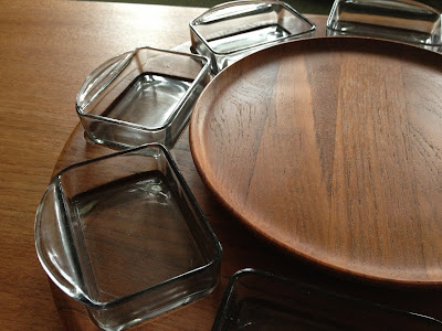
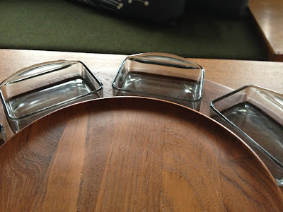
Best design purchase?
I love my vintage Ekornes Combina daybeds, and my Westnofa chair.
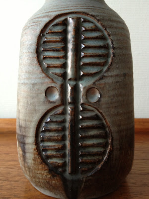
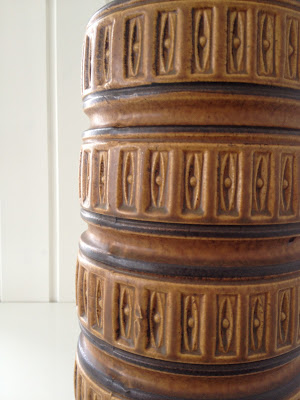
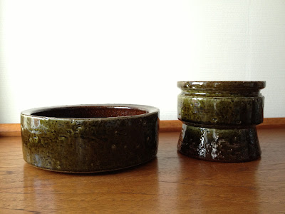
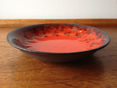
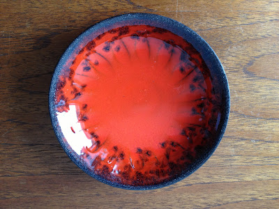
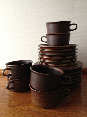
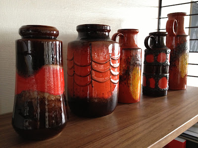
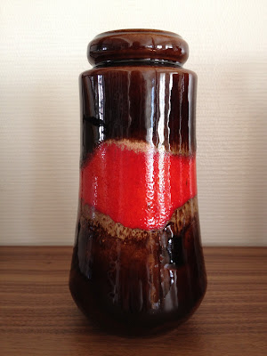
What are the colors in your home?
Teak, grey, black, white and a bit of olive green, white walls except for the bedrooms, which are a nice grey. My splashes of color are mainly my pottery.

How do you have your tea/ coffee?
I'm not a big tea drinker. If I do have a cuppa, it's an earl grey, no sugar, no milk. I take my coffee strong and black, americano in the morning, espresso after dinner.

Manuel or automatic?
Manuel can stop by anytime... Just kidding, I drive a manual. I actually like it, too!

What was the last thing you made and when?
I'm ashamed to say I haven't really made anything crafty for a long time.  I used to make small cardboard "sketches" for buildings, but even that's mostly virtual in cyberspace now... I'd love to take up macrame now, inspired by Pippa! I do make the occasional necklace out of stones or chunky pearls if I need one for an outfit, or some graphics.

Favorite quote or saying?
What doesn't kill you makes you stronger! We used to tell eachother that when I studied architecture...

Black and white or color?
I'd have to say black and white. With a splash of color! Or brown!

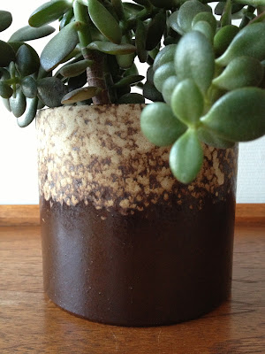
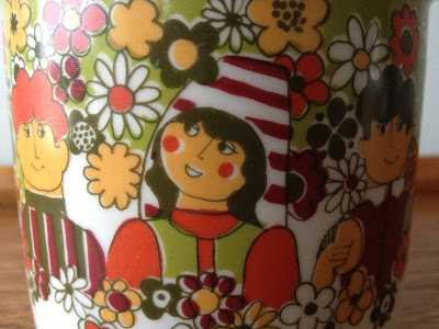
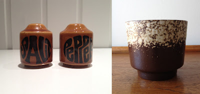
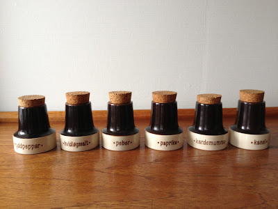
What was the last thrifted item you bought?
Meet major Salt and sargent Pepper! Love the flower power typeface, got them yesterday:-) In the same store I found a WG planter that I already have but couldn't leave behind... You can never have too many planters, right?


Vintage or retro?
Both, please?

Vegemite or Marmite?
I've never been Down Under, so I haven't tasted either of them! I'm very curious, though, I have absolutely NO idea of what they taste like!


My 11 questions are the following:

Do you have a favorite art piece? Which one?
What's your dream vacation?
Your favorite thrifted piece?
What's the one thing you want to do most in life?
What's your favorite dish?
Is what you do for a living the same thing you planned to do when you went to school?
Do you have a favorite song, past or present?
Which book is on your nightstand?
What's the craziest thing you've done?
Where do you see yourself in 10 years?
What's your favorite room in your house/ apartment, and why?
50s, 60s or 70s design?
If you could travel in time, to which period would you like to go? Why?


And now to the hard part! There are SO many great blogs out there, it's hard to pick only 11. Some of my favorites have already passed the 300 mark (you know who you are!), so even though you're not on the list, you know I love your blogs, right? Ok, here goes, my list of amazing blogs with less than 300 followers. (I can't figure out the Bloglovin' thing, and I'm not on facebook, so bear with me if I've missed something...) Some of you are pretty close to 300, and might have been awarded before, but a good thing can't be repeated often enough, right? Oops, I ended up with 14, oh well...


Lucy Violet Vintage
Retro Pottery Net
Retro Scandinavian
The Creekhouse
Hot Cool Vintage
Secondhand
Mid Mod Mom
Vintage Design Cologne
Keramikk
Fraupabst
The Little Black House
50 år för sent
Arctic Mum Blog
A Goode House (Can't find your stats, Stacey, but I'll take my chances:-)

The Japanese Country Cookbook

$
0
0
What are the chances of this book turning up in a local thriftstore over here? I guess the previous owner must have done some travelling. Not to Japan, though, which seems to be the obvious at first glance, but probably to the US.
The book was published in 1969 by Russ Rudzinski, the owner of a country- style japanese restaurant called Mingei- Ya on Union Street in San Fransisco. Apparently (from what I'm able to dig up on the web) this was quite a famous restaurant in the 60s, but was closed down a long time ago.

I love oriental food, and could easily have bought it just for the recipes, but it's the great graphics, layout, colors and paper I fell for. It's a beautifully crafted book, printed with black and red inks on brown textured rice paper. The pen drawings are beautiful and rich in detail. They're done by artist Mike Nelson, who I unfortuneately haven't been able to find out anything about. Anyone? I found a graphic artist by the same name, but too young to having been around, professionally, in the 60s.

The restaurant interior and courtyard must have been pretty amazing too, just listen to this quote that I found in the food column of SF Weekly:

 "I was reminded of a long- gone restaurant in san Fransisco, Mingei- Ya, a woody Japanese country- style place that felt as if you were dining inside an especially beautiful cedar- lined closet." That says it all, huh? I've always been amazed about how much Japanese and Nordic aesthetics have in common, even though they are, literally worlds apart, the simple lines, the love of wood. You see it all over the fields of architecture and design, both contemporary and modernist.

I found some more great stuff this weekend, but decided this deserved a feature of it's own. To be continued!

PS. If you want to see some more amazing graphics, head on over to Potshots and have a look at this beautiful children's book from 1911! Great blog, by the way, highly recommend it:-)


Great new findings

$
0
0
Besides the Japanese Country Cookbook, I found some more great stuff this weekend. First out is this beautiful glass bowl. I know it's from Hadeland, probably 60s, but that's all I know! I'd appreciate some helpful hints here:-) It's got the exact same color as the Greenland series by Arne Jon Jutrem, so I wonder if he might be the artist behind this too. It's a substantial piece, 28 cm in diameter, is shaped like a mushroom and has a very heavy base.


I found this gorgeous large serving plate and jug, both in Sera by Stavangerflint. I have a large lidded dish and rectangular serving plate from an earlier hunting trip, that you can see it this post, and a small rectangular plate that you can see here. Sera was designed by Inger Waage and was in production from 1970- 79. The Sera pattern is so shiny, which always makes it really hard to photograph. I love the combination of brown and black, my husband thinks it's a bit gloomy...


Then I found two more lidded serving dishes in the Korulen pattern from Egersund Fayance (The small one in front is a sugar bowl I already had). They very rarely appear in thrift stores, so if you should stumble upon them, you just grab them and run. After paying, of course...
How fitting that the sun decided to bathe them in her rays! Noticed I said "her"? I'm pretty sure it's a she! Korulen was in production at Egersund Fayance from 1971 to 76. The design is called Unique (Kaare Blokk Johansen) and the decor Solsikke (Sunflower) or Korulen (Unni Margrethe Johnsen). They also came in a sunny orange version without the sunflower decor, but with brown trim, and a version in brown with orange lids. The colors, the pattern and the shape of the lids are all sooo wonderful. You really can't avoid smiling when you look at them. I was overjoyed when I found a set of 8 plates, cups and saucers, as well as this sugar bowl and a serving plate a little while ago in an add on Finn. You can see it here.


Finally, I found another one of the small WG planters in brown with the cream pattern or speckles on them. I love these, and I picked up a cute (but ever so hostile:-) cactus for it yesterday. The whole family below. Wish you a sunny week:-)


Icelandic, Danish, Norwegian, Finnish & German pottery

$
0
0
This post is gonna be a tour of the Nordic countries (minus Sweden, sorry- no Swedish finds this time!), as well as a visit to Germany. This weekend was amazing, thrifting wise, I found some great stuff, at ridiculously low prizes in three different charity stores. You gotta love those, so much more fun than ebay, as you get the thrill of the treasure hunt as a bonus:-) Nothing beats searching through a pile of junk,and then suddenly hit the jackpot. That's what it felt like this Saturday. I really need to cool it....

This is a beautiful piece of Danish studio pottery which was mine for only 30 NOK, around 5 USD, I really had to rub my eyes! The edge looks blue in the second image, it's not. The first one represents the colors best, the red is a rich orangy, and the brown is really dark, almost black. The initials KK is still a mystery to me, so I'm counting on you Danes out there:-) The only Danish pottery maker I can find with these initials is Knud Kyhn (1880- 1969). When I search the web for works by Kyhn, however, I find mainly animal sculptures, so it might not be the "KK" I'm looking for. I'm also guessing there must be a KK that was born a little later.


Speaking of Danish, I've been admiring the Søholm spice jars for ages but have never found any in the thrifts over here. But suddenly there they were in all their glory- a set of six jars at 10 NOK a piece- that's less than 2 USD!! I didn't notice before I washed them that some have text in Danish and some in Swedish. I guess they were customized for export.


On the same table as the beautiful Danish KK studio pottery, I spotted a piece of pottery that I've been really hoping to find one day. It's a piece of Icelandic Glit lava pottery. I don't know a great deal about it, but I know the ceramic studio was founded by Ragnar Kjartansson in 1958 and that they're known for using lava rocks (hraun) in the glaze. I don't think that's the case with this piece, unless the lava is actually blended into the clay. I find the roughness of icelandic pottery really beautiful, it's a quality that really reflects the gorgeous landscape it comes from. The symbol in the middle looks ancient and mythical, also in true Icelandic spirit. I'm  really excited to have found this piece!


Over to another country known for it's beautiful rustic designs- Finland! I know there's a looot of Arabia Ruska around, but I still love finding new pieces. If someone told me years ago that I would be collecting Ruska, I wouldn't have believed it. Growing up, I thought it was really ugly. But it's a design that has grown on me and taken me by surprise. It's a bit challenging and has certainly not been love at first sight, but when I fell, I fell hard. I love how it's all about that beautiful rustic glaze, that has all the browns you can imagine, from rich chocolate to almost black. I found this tea set for six.


A new handsome German, before I leave the rustic lava theme! This Scheurich is in neutral tones and a very cheerful orangy red that will brighten up things a bit while we're waiting for the spring to prove that it's here for sure:-)


Back to Scandinavia again, to Norway, more precicely to the southwestern part where I grew up. Some may have noticed that I'm pretty patriotic about our great pride and joy, Stavangerflint and Figgjo:-) Have you ever seen this beautiful Stavangerflint pattern? I thought I'd seen them all, but obviously not! I'm sorry, the photo was taken in the shop, it's not a good one. The shapes are the same as the "Nordkapp", but the pattern and colors are new to me. The teapot is gorgeous. I've e- mailed a photo to someone who might know what the pattern is called, I'll be sure to inform you if I find out! As beautiful as the set were, I actually left it behind. I have to narrow it down, I can't get everything. Sometimes I wish I had a shop... Well, I left the set hoping someone will be happy to find it complete. Later that same day, I actually found a serving plate in that same pattern in another shop, and guess what? I took it home:-)


Finally, two small dishes that I've previously only seen on the web. They're made by Stavangerflint for the Viking Hotel in Oslo in the 60s. They' re rather small, around 10 cm across, they might be ashtrays or butterdishes, I'm not sure. I do like the rather bold black on white pattern, it's quite striking. I wonder if there was a wide range of products in this series, does anyone know?


Sweet Annika...and Egersund mystery solved!!

$
0
0
I've had a bit of a dryspell, thrift wise, much of it due to crazy days at work. Today I finally had a couple of hours to myself and squeezed in some thrifting between driving the boys to soccer practice and the Saturday grocery shopping. It's fleamarket season over here. It's a sure sign that spring is finally here, fleamarkets are being arranged all over the place. Today I stopped at four, one of them was really great with an auction and all, but alas I was a bit late. All I found was one piece, so you're gonna get it from all angles:-)
It's a really cute one, though, I've developed a crush on "Annika" by Rørstrand. It was designed by Marianne Westman and was in production from 1972. The colors are so lovely, rich brown and mustardy yellow. It reminds me so much of a little bird, the way they cosy up on a branch, all round and fluffy. See what I mean?
Annika has some similarities with "Honey" by Stavangerflint, designed approximately at the same time, but the pieces are more rounded. This little jug sits really well in your hand, it's like it's begging to be held!


I also did some detective work. Remember my mystery Egersund teapot? I just got an e- mail from the Egersund fayence museum with some information about it! The model is "Cirkel", designed by Kaare Blokk- Johansen (who also designed "Unique"), and the decor is "Cherie" by Ingrid Marcussen. It was in production from 1965 to 68. Mystery solved!

Manrique, part three

$
0
0
I've studied a LOOOT of buildings, and I'm never impressed with the glitzy, the glossy, the biggest, the tallest. If you have huge amounts of money, anything is possible and it makes me lose interest. What really impresses me are great buildings with really narrow budgets, buildings that capture the essence of a landscape or buildings that bring something new into the field of architecture. Not only facades decorated in a new way, but something more fundamental.

I guess what I liked so much about the Manrique buildings is that they took me by surprise, much due to their surprisingly close relationship to the different landscapes they're placed in, and their innovative and sculptural qualities. The fact that they had some pretty amazing 60s and 70s features didn't harm either:-)

The first one I showed you, challenges our perception of how a home could be. Lit only from above, the dwelling is like a cave that you might perceive as either protective or claustrophobic, and the most basic quality of a home, the view out of a window, is nonexistent. Quite a lot of buildings challenge how much transparency we can take, this does quite the opposite. It's an amazingly cool dwelling, a complete work of art, but would you live there? I mean, really? Probably not. It is, without doubt, the most challenging of the three buildings.

The second one is also a cave, but a very different one. It's all about the wind, the view, the scary height and the protective feeling of the mountain literally surrounding and protecting you.

This third building is all about fire. It's a restaurant/ visitors centre in Timanfaya National Park, in the Montañas del Fuego (Fire Mountains), built in 1970. Manrique was quite an eco- activist and is given much of the credit for the preservation of the islands' strange and dramatic landscapes. The island has a UNESCO Biosphere Reserve "protected site status", which is the resason why tourism is held in a tight leash.

The Montañas del Fuego were created between 1730 and 1736 when more than 100 volcanoes, covering more than 50 km², rose up and devastated this part of the island (including several villages). The last eruptions were in 1824, however due to the low rainfall (and therefore lack of erosion) this area appears much the same as it did just after the eruptions. In 1968 the area was declared a national park, Parque Nacional de Timanfaya. This part of the island is very unique, unlike anything you've seen before, because of its unique 'Martian' landscape and rare plant species.


The building lies horizontally on the highest of the volcanic hilltops, the Islote del Hilario, like a part of the hill itself. Just 10 centimeters under the surface, the temperature of the ground is 140 degrees Celcius, 6 meters deeper, it's 400. The building had to be constructed of non- combustible materials, like stone, glass and metal. There is a special kind of heat insulation in the floors.


It's hard to imagine just how hot the temperature below the surface actually is, but it's demonstrated outside the building. Dry brush is thrown into a shallow hole in the ground and catches fire immediately. The most spectacular demonstration is when water is poured into a hole and erupts seconds later like an icelandic geyser. The restaurant kitchen utilizes the geothermal heat by preparing the food on a unique barbecue (a cast-iron grill placed over a large hole in the ground), powered by the inferno boiling beneath the earth's crust.The barbecue, the visualization of the natural drama going on just below your feet, is wonderfully articulated as a focuspoint in the building's architecture, it's inside the cone shaped volume in the first picture.


The entrance area has a supporting column disguised as a wonderful sculpture. All around are vertical windows that gives you glimpses of the landscape outside and prepares you for the panoramic views in the dining area. If you look beyond the typical spanish restaurant style wooden furniture and checkered tablecloths and have a closer look at the construction,  the inner courtyard and the narrow band of windows that makes the roof appear floating, you can see it's a wonderful space.


In between the building volumes are areas sheltered by stone walls, protecting you from the strong wind. These are so strong, sculptural and sharp, and made out of lava stone, represent the landscape, but in a geometricized version


I hope I haven't bored you with too much architecture talk, I'm sure the next posts will be thrifting updates:-)

Living room snaps

$
0
0
The gorgeous spring sun seeping through the blinds inspired me to take a few pics around the livingroom.
I'm constantly arranging and rearranging my String shelves. I love them to bits, but never seem to get the setup just how I want it. But I guess that's part of the fun, right? I've never been big on color, especially not red. I've always leaned towards neutrals, however, these crazy colored germans have really won me over (they're all Scheurich). Apart from the crazy germans the shelves are currently holding WG planters, a Pantella lamp, a Muuto vase (a birthday present chosen by my dad!!), vintage Hadeland pieces, danish studio pottery, small model Panton chairs and books... My comfy leather chair is a Siesta chair, designed by Ingmar Relling in 1965 for norwegian manufacturer Westnofa. It's still in production, although by another company. Relling was the norwegian Wegner, a great designer from the Scandinavian design movement. You probably know that The Chair by Wegner was made famous by Kennedy in a tv debate, but did you know there are 16 Siesta chairs in The White House?


Ingmar Relling also designed these great daybeds for norwegian manufacturer Ekornes in the mid- sixties. They're called Combina and were part of a vey successful line of furniture that could be combined in many ways, hence the name Combina. We used to have them at home when I grew up, and one of them became my bed when my parents got new couches. The seat could be lifted to store my pillow and duvet when I had friends over. It's a classic mid- century piece of furniture, similar to several other daybeds of the era. These are not the ones we had back home, I found them in the exact same color after I put an ad on FINN (the Norwegian equivalent to Craigslist) What are the chances?


The aerial photos on the wall are for a project I did a few years ago. It's the last time I did one that didn't have a client. These are diagrams of the energy content and direction of waves and mapping of the topography on a site for a wave powerplant. I did it out of pure obsession and a solid dose of concern for landscape preservation and it turned into a thesis....


There's gotta be a solid dose of greenery in a home, right? I looove plants and planters. My most treasured planters are the 100 year old brown storage jars from Sandnes, near my childhood hometown. They were made by Graveren (later Gann Graveren) while they were still producing ordinary storage jars, baking bowls and roof tiles, before they started attracting artist and produced more colorful, patterned pieces. They're so rustic and cosy and remind me so much of home. My parents were kind enough to pick up these for me from an antiques store back home, they sometimes prefer driving instead of flying when they come to visit. They even found me a really large one.


My mom and dad are so sweet. They even found me this credenza in ... you might have guessed ... Stavanger!! It was made by a local furniture factory called Svena møbler, that was really big in the 60s. It's got such a great shape and so many gorgeous details, I just love it! Through the door you can see my new kitchen. My goal was to get a better connection between the living room and kitchen, color and material- wise, and I'm so glad it's finally done! I'm trying to convince my husband to paint the wall behind the credenza black. It would be such a great contrast to the teak and the kitchen wall that you see through the door. No luck so far... The big old radio next to the door used to belong to my husband's grandparents, and we were so lucky to have it handed down to us. I'm not sure if it's working, but it sure is a great place to put some pottery.


Finally, I'm sneaking in some pics from the kitchen counter- new use for old pottery, Stavangerflint Sera and Brunette. Have a great week!! 


"Retro & Vintage Inspired Corner of My Home" link up

$
0
0


Today I'm joining in the Retro & Vintage Inspired Corner of My Home link-up with the Kylie of Lucy Violet Vintage and Donna of Hung up on Retro! I highly recommend their amazing blogs. What a great initiative, I already see there's a lot of great homes to drool over, I can't wait to see it all!

Ok, here goes. What to show you? If you read my blog occasionally, and have a feeling you've seen these pics before, well, you have... This  turned out to be our "waking up the garden and putting away the winter clothes weekend", and the living room is full of stuff to be sorted. Not a great photoshoot weekend in other words... I kinda wish I'd saved my last post for this! I don't have any great freshly styled spots, so I thought I'd dig through my files and give you a tour along the "teak and pottery trail":-) Apologies to those of you who've seen the pictures before, I hope I at least manage to put them together differently and show you the red...or rather brown, thread!

Starting in the kitchen. The cabinets are the results of a looong search through just about everything on the market, but finally I found a small company, Tingbø (tingbo.no), that makes the most beautiful handmade kitchens, using great wood surfaces. I was gonna settle for walnut, until they told me they could make me one in teak!!! That gave me the opportunity to make a closer connection between the kitchen and the next door living room. It's the only teak kitchen they've made!

My favorite features in the kitchen are the amazing wood surfaces and the minimal handle- and knob-less drawers and doors. I'm also really pleased about the choice of black accents, I really had to persuade the electrician, he thought I was mad for choosing black switches and power points (you can see those in one of the links below) on white walls...


I love to fill my kitchen with thrift finds and heirlooms from the stretch of coast where where I grew up, Stavangerflint, Figgjo and Egersunds Fayance, as well as Danish, Finnish, Swedish and German favorites:-)
If you wanna see more kitchen pics, have a look here and here!
 
Thrifted Søholm spice jars, they were a steal at less than 2 USD a piece!


Figgjo Tor Viking teamed up with modern Iittala Ego cups. The creamer and sugar bowl belonged to my mom.

 
Scheurich planters
 

"Alkemuggen"(Razorbill pitcher/ jug), named after the north Atlantic sea bird. It was designed in 1910 by Jakob Sømme, and was in production until 1973. It's is considered one of the factory's most iconic pieces. see the beautiful art nouveau influence? 


Imagine such modern and clean lines already in 1977! Designed by Erik Magnussen.


My Egersund Korulen and the Arabia Ruska are great favorites and in almost daily use.


Moving on to the adjacent dining area. My favorite here is the teak credenza that my parents found in Stavanger. They're my eyes and ears in the market back home:-) On it, there's a thrifted Søholm lamp and some German, Norwegian, Danish and even Icelandic pottery. And plants. You gotta have plants, right?


Søholm lamp, designed by Einar Johansen


Scheurich bowl, Ekeby vase
 
  
Just found these Stelton place mats on sale, I fell for the cutout pattern, and love black with teak. 


My husband's grandparent's old Radionette with WG pottery. The lamp is a mystery piece.

End destination- the spot where we slouch about in the afternoons and evenings. I got the Eames LCW for my 40th birthday. It's got such beautiful sculptural qualities, I adore how even the legs are made of wood. I have some furniture here with great sentimental value, the table was my grandparents, the Westnofa Siesta and the Ekornes Combina daybeds are the exact same we had when I grew up, even tha same colors. You can read more about them in my last post. The String shelving is a relatively new acquisition and I love it to bits! It's such a great display space for books, lamps, pottery, you name it. And it looks so light, just like those other great shelving systems from that same glorious era. The thick wool blanket and pillows are "CD" by Rørostweed, an old Norwegian company that has renewed their profile with really great designs. The narrow pillows I made from Ikea fabric.


That's my retro and vintage, folks, now I'm heading over to Kylie's and Donna's to do some serious drooling!

Waking up the garden

$
0
0
We did some much needed gardening last weekend. This year's winter has been hard on the garden, and I can't remember the last time spring arrived this late. After doing some removal of plants that didn't make it, and some general tidying up, I picked up this beautiful little japanese maple at the local nursery. I love maples, the leaves are so incredibly elegant an the colors are just breathtaking. I have a lot of winter greens in my garden as a kind of "base", and like to add plants that really change with the seasons. I adore autumn colors and maples are true autumn beauties. This specimen  actually has autumn colors now, what could be more perfect?


The ivy is green year around. Here, they're mingling with a creper that I don't know the english name for. I'm not big on flowers, I do, however, love to mix the solid greens with plants that have other colors to create variations. This picture actually looks lik fall, but it's taken now, promise...


These are called "villvin" in Norwegian, after googleing I think "Virginia creepers" must be the name in English. I bought the as really small plants and they grow rapidly and now cover a tall stone wall. They get leaves quite late, in the early summer, but they're at their most spectacular in the fall, when they turn into every shade of red you can imagine.


This is how my cherry tree looks like right now. It's right outside my kitchen window. Pretty soon it will be in full bloom.


These little anemones (Hvitveis in Norwegian) are a sure sign of spring in Scandinavia. They're not from my garden, but grow pretty much eveywhere right now, especially in areas a bit shaded by trees. Every Scandinavian mom get little bouquets of these, picked by our kids on their way from school. It's always such a great joy!


Recent thrifts

$
0
0
On Thursday I found something amazing in a nearby thriftstore. A very sweet lady runs it, and I've found several great pieces there. She had spent a few hours unpacking new stock, and had put this out in the shop 3 minutes before I walked in the door and snatched it! That's what I call timing:-) It's a large Digsmed Lazy Suzan, made around 1960 by Digsmed, Denmark. Digsmed and Dansk pieces very rarely appear in thrifts here, I suspect a lot of them emigrated to the US or stayed in the motherland.

It's large, a whopping 40 cm across, in massive fine grained teak and has a rich delicious color. It has two turntables and 8 smoke colored glass bowls. They're all intact and the teak is in excellent condition. The price was REALLY reasonable, I saw a similar one on the web that was 5 times what I paid... The storeowner has reserved something for me that has been on my wishlist for a long time, they just need to be unpacked from her heap of boxes. Nothing spectacular or rare, just something I've been lusting for and want to start collecting. I'll reveal what it is soon, I hope:-)


I recently found these Stelton place mats on sale. I hope it's not because they will be discontinued, but I suspect it is... They're in a 5 mm thick felt, and have this great cutout pattern in the middle. Too bad a plate will cover it, but you still have that richly textured, wonderfully shaped mat. I love black with teak, that's why I decided on a joint photoshoot:-)


And what do you know- a new kid on the block, or handsome German,  I guess we like to call them:-) Can you spot the newcomer? It's the red- belted brown Scheurich to the left!


My aunt's cabin

$
0
0
I can't wait to visit my home town this summer. I usually spend Easter there too. This year, however, I didn't get the chance to go, so I'm really, really homesick. Even though I've lived half my life away from it, I still call my beloved stretch of North sea coast home. It's truly where my heart is. Every time I go, one of my top priorities is to spend a day at my aunt's cabin. It's at a place that, according to my vocabulary, is pretty close to paradise.

The cabin is tiny and was built right after WW2. It has wood cladding, on both the exterior and interior, and is by no means great architecture. The beauty is in the wild flowers in the windowsill, the embroidered cushions, the old pots and pans, the woven wall hangings. It's not even meant to be either "vintage" or any other kind of style, she's just gathered what she needs there. She has an orange Cathrineholm bowl there that she uses for biscuits, but she has no idea of how sought after they are....

My aunt and uncle's farm is just 5 minutes away, and my aunt mainly uses the cabin to spend a few hours walking the beach, picking some wild flowers and having some coffee while watching the weather and the gorgeous scenery. My uncle doesn't have the patience... Even though she has 6 (!!) daughters, she always makes time to spend a day there with us, because she knows I appreciate it so much. She brings along some homemade cake and coffee in a basket. There is no water, so we do the dishes by hand afterwards with hot water from a thermos.

We always go for a long walk along the beach that she has right outside her doorstep, it's one of the widest and most beautiful in the area, and the one that has the tallest sanddunes. We walk the beach on our way north, and often walk behind the ridge of dunes on our way back. On the beach we find driftwood, bottles from the North sea shipping lanes, stranded jellyfish, polished stones and beach flowers. In the sheltered area behind the dunes there's rich plantlife and you can find all kinds of strange insects. There is a lot of birdwatching, as this is the point where the migrating birds from all over the country leave our shores for warmer ones in the fall, and where the first ones are seen back in the spring.

I'll leave you with pictures from my visit there last summer, and hopefully there will be some new ones in a couple of months:-) I will try to get some decent pictures of a really beautiful piece of architecture nearby, a small museum of the area's flora and fauna, designed by a local architect who, sadly, passed away too early. He really grasped the characteristics of the landscape.


Tribute to Tapio

$
0
0

Isn't this picture of Tapio Wirkkala amazing? (Image courtesy of Rut Bryk Foundation) He was such an incredibly talented designer/ artist who didn't really want to draw a line between the two diciplines. I find that very evident in his work. I've always loved  his Ultima Thule series, designed in 1968. It's so breathtakingly beautiful, looking like eternally melting ice. The design is both beautiful AND intriguing, I keep noticing more great details all the time. The only downside is that they don't stack, but I totally forgive them, and could easily clear out all my other glasses to make room for them.

Imagine my joy this morning when I found an ad for 7 of these beauties! Turned out the seller was fairly local too, and I was able to pick them up just an hour later! Until now, I've only found four dessert bowls. Ultima Thule is still being sold in shops over here, but buying them new in a shop somehow feels like cheating. Besides, I love the idea of great design being passed on rather than gathering dust in a cabinet somewhere.

My lucky find today consists of one large beer/ longdrinks glass, three large tumblers and three small ones. When I came home and unwrapped them, I noticed that the seller had thrown in a beautiful small creamer too. The weather is so amazing here today, we've had clear blue skies and temperatures in the mid 20s. With the sun bathing my living room in it's rays, I couldn't stop photographing these beautiful icicles.


Did you know they were originally designed for Finnair? They were comissioned for their new route between Helsinki and New York in 1969. Wirkkala also designed plastic tableware and cutlery for the same route. The plastic products were produced by Fiskars, the Iittala Group's parent company today. Ultima Thule has become one of Iittala's most popular glassware ranges ever.

When holding an Ultima Thule piece in your hands, the image most likely to come to mind is of a block of ice that has melted, as if by nature, into a glass. In reality, the rough exterior characteristic of these glasses was the result of years of development work: "For years now, I have been pursing the ideas expressed in these glasses. Earlier, I tried breaking up the surface by cutting, but only now do I think I'm on the right track when I get the desired result in the glass-blowing stage."

The birth of the Ultima Thule range of glassware in 1968 tells us a lot about Wirkkala's approach to design. Inspired by the melting ice in Lapland, the form he created for Ultima Thule is based on what is known as the ice glass technique, which Wirkkala was involved with in developing at the Iittala Glassworks. Always the innovator and always keen to roll his sleeves up, Wirkkala did this part of the job himself at first. The original molds for the collection were hand carved by Tapio in wood, so that the first pouring of hot dripping glass altered the mold as it ran down the sides, making the distinctive dripping effect.

Not surprisingly, Wirkkala began his career as a sculptor and through his works in plywood, acquired a unique position in between applied art and sculpture. He was one of the earliest representatives of abstract sculpture in Finland. His best-known sculpture was most probably Ultima Thule in laminated birch (Images below, courtesy of Kaufmann-mercantile.com and expo67.ncf.ca) which he made for Expo 67 in Montreal. The resemblance to an arctic landscape is striking. Tapio Wirkkala did not wish to mark any boundaries between his work in sculpture and design. For him, they were about  the same thing.


A large amount of his sculptures were carved out of  plywood, as these in the image below, from an exhibition at Sørlandets kunstmuseum last year. (Image courtesy of skmu.no)


Never having had a tradition of lavishness or luxury materials, Finnish post- war designers embraced the concept of clean lines and truth to materials, and combined it with a naturalist craftsman feel. Tapio was trained as a decorative carver and sculptor, graduating in 1936 from the Institute of Industrial Arts in Helsinki. He was so adept in his art, that he would often carve the molds for his pieces by hand, including the ones made of metal. This unusual level of personal skill ensured that the hand of the designer was evident in the final product, and allowed him more control over the surfaces and textures of each piece than if he were simply handing over a stack of flat sketches to be interpreted by the factory foreman.

Nature was an important source of inspiration for Wirkkala, and he felt most relaxed and free of the pressures of his work as an international designer in Lapland. During the time he spent there, he was always whittling away at a piece of wood, sketching, or doing something else with his hands. The latter were very much an extension of his mind. "Making things with my hands means a lot to me. I could even say that when I sculpt or mould nature's materials it has an almost therapeutic effect. They inspire me and lead me to new experiments. They transport me into another world. A world in which, if eyesight fails, my fingertips see the movement and the continuous emergence of geometrical forms."


Sources:
Viewing all 68 articles
Browse latest View live