Quantcast
Channel: stuff that makes my heart beat faster
Viewing all 68 articles
Browse latest View live

Festivo - more finnish gorgeousness

$
0
0
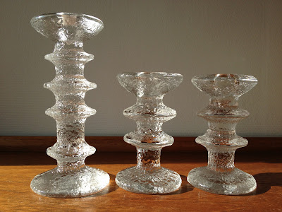
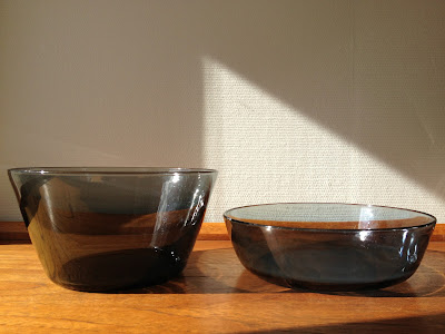
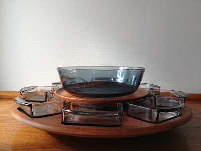
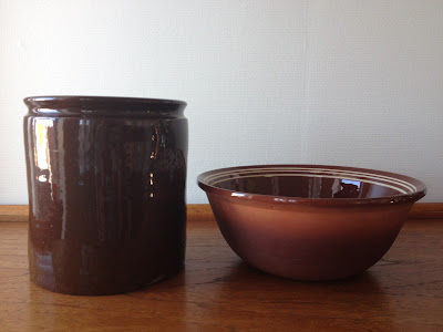
I have a thing for icy cool finnish glass, and this week has been very rewarding in that respect. I found some gorgeous Ultima Thule glasses, featured in my previous post, and now these! Remember I mentioned in a recent post that the lady in my nearby thriftstore had reserved something for me that just needed to be unpacked from all her boxes? That was four Festivo candle holders in two different sizes. Or at least I thought it was... When I popped by a few days ago, she was really sorry about having discovered they were copies. I was so disappointed, but bless her for not trying to convince me they were originals. However, yesterday, I found two specimen of the genuine article- they're even signed! Sadly there are many copies around. Over here, I often see the kind that are too regular and don't have that special icy expression at all. The real ones have a rougher surface and look more "individual". If you're lucky, like I was this time, you'll find the older ones that have Sarpaneva's initials TS etched under the base. I highly recommend you to check out this post over at RetroScandinavian if you wanna make sure you're getting the real deal. It's a really great blog, by the way, a great resource on Scandinavian pottery and glass.


I want to collect a whole group in different heights, like in this great retro Iittala ad I found. It must date from the early years, maybe even from the time they were launched. The retro typeface is so cool. Aren't they gorgeous in a large group like that? The tall ones are hard to find, we'll see how that goes... My mom has a pair with one ring that my dad bought for her on a business trip to Helsinki in the early 70s. She confessed to me a little while ago that she's never liked them, and wants me to have them. She wants to break it to my dad gently, though, she never told him she didn't like them... For the record; my dad doesn't read my blog!


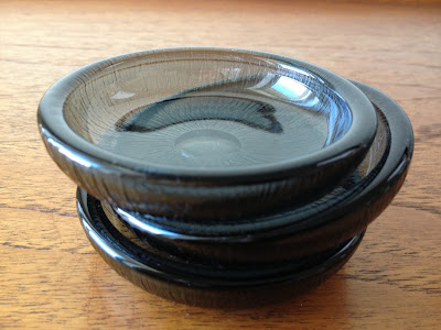
I guess many of you are well acquainted with Festivo and the amazing Timo Sarpaneva, but if you're not- let me introduce you! The story goes that designer Timo Sarpaneva originally designed the Festivo candle holder as a wine glass for himself. The idea was to fit an entire bottle of wine into a single glass. A rough-surfaced, ice-like glass was born, with the bowl and base sections blown separately. When the base sections of the glasses were sitting in the factory on their own, the idea came to use them as candle holders – and so the prototype of a new classic was born. The Festivo series has been manufactured since 1967 and has become a true icon.

Timo Sarpaneva came from a family of craftsmen. He would mention his maternal grandfather, a blacksmith, whose profession Sarpaneva claimed as his family's tradition "for hundreds of years," and said others were textile artists noting his mother used to make tea cozies. His one-year-older brother Pentti was a graphic designer and made the most amazing brutalist bronze and silver jewelry.

Timo Sarpaneva's professional response to glass was related to his early memories of molten metal in his grandfather's workshop. A childhood sensation that he would periodically recount later as inspirational for his innovative approach to glass objects spoke of transparency and space:
"At the age of eight or nine, I held a piece of ice in my hand until I'd made a hole in it with my warm finger."
His organic hole in a glass body then appeared at roughly the same time as Henry Moore began to make use of concavities in his human sculptures, and some of his other work with glass is suggestive of that experience.

Sarpaneva graduated from the Institute for Industrial Arts (the forerunner of the University of Arts and Design in Helsinki in 1948 and received a PhD later. Shortly after he began to work with glass. He was hired by Iittala in 1951. Radical for that time, his involvement extended to the design of the packaging and of Iittala's name with a prominent, white, lower-case letter i in a red circle as the new line's trademark, which the company then adopted as its universal logo through the 21st century.

Sarpaneva's first international recognition in glass work came with a Grand Prix from the Milan Triennale  in 1954 that included Sarpaneva's series Orkidea ("Orchid"), Kajakki ("Kayak"), and Lansetti ("Lancet") adopted for production by Iittala.

Trained as a graphic designer, he spent the majority of his life in industrial design while seeing himself more as an artist than a designer. During his amazing career, he created great designs in glass, porcelain, fabric and cast iron, to name a few. However, glass was always closest to his heart. He said of his favorite material:
"Glass is very mysterious. It's changing all the time. That's what makes it magical. It released me from the conventional and the three-dimensional. It opened its deepest reaches to me and took me on a journey to a fourth dimension. I understood the opportunities that clear, transparent glass gives to an artist and designer."

A few new ones

$
0
0
There hasn't been much time for thrifting lately, May is by far the busiest month of the year, both at home and at work. I have managed just a few small ones that I thought I'd share.
A little while ago, I found this beige and brown vase by Bay West Germany. Right after, I found this red one with the exact same shape at a local flea market.


Did you know Stavangerflint didn't just make souvenir cups and plates, there were even souvenir skillets? I didn't, until I got the latest addition to my Stavanger souvenir collection when my mom and dad visited for constitution day. And yes, I now have three and hereby declare it a collection:-)

Most of these were designed by Anne Lofthus, I guess that's also the case with the skillet. The motifs are from around town. On the handle is a statue of a boy feeding some ducks, which stands outside my old high school, which again, is next to the cathedral where I got married, showed to the right. This shows the gothic facade facing east, while on the plate I've shown in a previous post, the roman facade to the west is depicted.
In the bottom are the famous ducks that made the police stop the traffic to help them travel safely from the harbour to the city pond. The story made the front page of several newspapers, I think it was in the fifties or sixties.


Mom and dad also gave me this lovely Figgjo Bekkeblom (in latin: Caltha palustris) sugarbowl, designed in 79 by Rolf Frøyland,  they had found in an op shop. Sadly, the lid is missing, but I'll be on the lookout for one. I don't usually go for flower patterns, but this one is too beautiful to resist. What I especially like is the shapes of the stems, the lines have an art nouveau feel, I wonder if that was intentional? I've seen it very clearly on the plates in that pattern, where the stems frame the plate in a beautiful way. I also love that the flower is a very "humble" one, they're often the most lovely! It's found locally and has caught the eye of the artist. 

That same flower also inspired another artist to make a series for Egersund fayence some years earlier. Kitty Kielland (female landscape painter from Stavanger, sister of famous Norwegian author Alexander Kielland) designed their Bekkeblom pattern in 1901. 


The final pieces today are two Kosta Boda snowball candle holders, designed by Ann Wärff in 1973. They're not at all hard to find in thrift stores over here, and they're still in production, just like the finnish classics featured in my two previous posts. The votives sit deep into the center of the snowball and lets the textured glass break the light in all directions making the whole thing glow from inside. It's a very beautiful sight on a dark scandinavian fall or winter night...


I'm feeling rather good about myself, having also lightly sanded and oiled all the surfaces of my new teak kitchen this weekend. The new wood surfaces recieved one coat of oil before assembly, and the treatment should be repeated a few times. i was a bit worried that the oil would streak and go on unevenly, but the oil I got from the manufacturer was very lightweight and fluid, and a joy to work with. The surfaces look amazing now, the extra coat of oil did a lot of good. That's all for now, I wish you a great week:-)


Pieces of teak, glass and pottery

$
0
0

This weekend has been one of the really great ones. The weather has been sunny and warm, allowing us to have all meals out on the terrace. I love that. I didn't think I'd be doing much thrifting, but I squeezed in a small stop on my way home from work on friday, and a small trip late this afternoon. I found some stuff that I don't usually find, which was very exciting. At the local salvation Army store on friday, I found another Ultima Thule tumbler (for information, look here). I collect them, and really hope they keep turning up.

.
There was also another Kosta Boda snowball votive holder, designed by Ann Wärff in 1973. I found two last week, so there's now a trio.


More glass, I found three small smoky grey Hadeland Fersken (peach) dishes, an award winning design by Willy Johansson in 1956. I guess they were originally designed as individual butter dishes, but I can also imagine they'll be great for soy or ponzu sauce for sushi.


I found this Figgjo Market piece designed by Turi Gramstad Oliver. Market is a rare find over here. A quick search on the web reveals where they all are... (rather large continent to the west:-) I have this one and a lidded serving dish. Unfortuneately, the lid was repaired with glue after having been broken, as is often the case with these. The lids are heavy and fall off very easily. I guess it will get a new life as a small planter in my kitchen in the company of two siblings, Folklore and August. You gotta love those quirky market scenes with all the glorious detail! The butter boxes were designed for what used to be the exact shape of a package of 500 grams of margarine here in Norway. That was later changed into a more rectangular shape, and consequently, Figgjo started making the lower rectangular butter boxes, like my Folklore one below (More Folklore here and here). 


Also, waiting for me when I came home on friday, was a package containing a four ring Festivo for my new collection, a bargain on Etsy. I now have three!!


Saturday was spent in the garden, doing a little bit of grooming. Today, my husband left early for New York, the kids were off with friends and I felt like a bit of thrifting:-) For a long time I've been curious about a lady who regularly has ads on Finn (the norwegian equivalent to Craigslist). She lives a 40 minute drive away from me, and I decided it was time to pay her a visit. She sells all kinds of retro pieces, and has an impressive glass collection. She has a room she calls the "retro room", which is covered in teak shelving full of treasures. She uses what she earns from her sales to restore her beautiful art nouveau house from 1906, and who wouldn't want to sponsor such a noble deed? I hope she doesn't mind me publishing a photo. Her current project is to restore the windows. I have to admit, the house itself was half the purpose of my trip. I love art nouveau, both my own home town and my mother's (Ålesund) has a lot of it, and I think I really fell in love when I lived in Brussels at the age of 15- 16 and visited Victor Horta's house. For you foreign guys, this is what our wooden art nouveau houses looks like. Isn't it beautiful?


I could have bought pretty much everything she had on display, but I really needed to restrain myself. A few goodies came along, though, and I will definitely be going back! The first things I fell for are these wonderful salt and pepper shakers and the salad servers and spoon in steel and teak. I'm not sure who designed the salt and pepper set, but they're most probably danish. They're large and heavy, and I will give them a light sanding and coat of oil to bring out that beautiful lustre. The salad servers and spoon are so incredibly elegant. I've seen them before on the web and have been hoping to find them one day. I know for sure they're norwegian, and I think they're designed by Thor Bjørklund who invented and patented the typical norwegian cheese slicer in 1925. I'll have to see if I can find out some more.


Next pieces I found are two Hadeland Multe bowls, also in one of my favorite glass colors, smoky grey. The Multe (cloudberry) series was designed by Willy Johansson in 1966, and was awarded "Merket for god design". I'm not sure how to translate that, but it's an award where both form and functionality is taken into consideration, given by the norwegian design counsil. They're so beautiful and simple, and I've been looking for one of these to fit the "upper deck" of my Digsmed lazy susan. It has small bowls in the same color and room for a bigger bowl on the upper level. I don't think there was one originally. 


The sweet lady had an impressive glass collection. It was hard to decide what to pick out, but what I couldn't leave behind were these modernist owls by norwegian artist Benny Motzfeldt (1909- 95). She was an amazing glass artist with a large and varied production. Aren't they gorgeous? They're not large, but very heavy, and will work as paper weights or just great sculptures.


The next piece I got was such a thrill to find. I've never seen Kronjyden Relief in thrift stores over here, so this is my first piece, a candle holder, hopefully there will be another one to join it. I love the color and the pattern, and totally agree with Birgitte, over at The Little Black House, that it resembles a danish (or norwegian for that sake) cornfield rather than something assosialted with leaves. "Relief" was designed by Jens H. Quistgaard in 1959-60.


After leaving the beautiful art nouveau home of the sweet icelandic lady, I made a quick stop at an antiques barn. They mainly have older pieces, but look what I found! A Figgjo Tor Viking lidded serving dish! It reminds me so much of growing up, we used to have this at home.Apart from this piece, I now have four small plates, two egg cups and a creamer and sugar bowl that was my mom and dad's.


Seeing double?

$
0
0
I can't believe I haven't been able to find out who designed the green mushroom shaped Hadeland glass bowl I found some time ago. Since my last post I've found another one, this time in smokey grey. I love their shape and how heavy and substantial they are. If anyone out there should have any information on these, please give me a holler. I'm kinda hoping they're by Jutrem, but I really haven't got a clue. The green one has the exact same shad of green as Jutrem's Grønland (Greenland) series.


I'm so intrigued buy the icelandic lava pottery maker Glit. I found a small dish some time ago (look here) and today another one appeared in a charity store. There isn't a whole lot of these around here, probably much due to the remoteness of that beautiful island, making both export and import expensive. I'm guessing that reflects the amount of pottery produced. The Glit ceramic studio was founded by Ragnar Kjartansson in 1958 and they're known for using lava rocks (hraun) in the glaze. the term "fat lava" suddenly got really meaningful. In the first piece I found, this isn't very evident, it's relatively smooth, but the one I found today has some really sharp pieces of lava. Just like the first one I found, this too has some kind of mysterious motif in the middle, I can't really make out what it is. Have a look at Ray's find, over at Retro Pottery Net. His Glit find is more abstract and colorful, almost expressionist, while the decor on mine look more mythical. I've seen lava turned into gemstones for jewellery, but here, the edgy and rough character of lava is intact and present. Even though I think my two little dishes have some kind of common theme, the stamps are different, suggesting that there might be some years between them. The one on the right has a stamp and a number, the other one a stamp and some initials.


That's todays lava. I'm hoping I'll find some more Glit pieces, a larger one would be such a thrill. The final finds today are two teacups, Stavangerflint Sera (Inger Waage, in production from 1970- 79) and Arabia Ruska (Ulla Procope, in production from 1961- 1999). The latter also came with a plate. I love both these designs and have found many pieces.


Finally!!!

$
0
0
Finally, my vacation has started! The last couple of weeks have been murder. It's always like that before the summer vacation, everybody want their projects done and the applications for building permits ready... Trying to stay creative and design some goodlooking buildings amidst the chaos is a challenge.  I'm totally worn out like an old dish rag, and I don't think I can yet fully grasp the fact that I now have a few weeks off. It's gonna be lovely! This year we're off to Italy in a couple of days, to cruise along the Ligurian coast for a couple of weeks. Then, of course, we'll spend some time in Stavanger. I haven't been able to enjoy all your gorgeous blogs lately, but I will catch up!

I celebrated my freedom today by hitting a couple of charity stores:-) and I found some great stuff. I'll start with these fat lava planters. They're larger than the Bay planters I've found earlier, which is great. They're not marked, but they have to be german. I love the combination of orangy red and brown.


Next things I found are these lovely Iittala Senaatori (Senator) champagne glasses by Timo Sarpaneva. Notice the base? Exactly the same design as the Festivo. I actually thought these glasses were from the Festivo series, as I know the design for the famous candle holders started out as an idea for a large wine glass. They're really elegant. I found two, and have to keep looking for them. I might actually "inaugurate" them tomorrow when my husband comes home from Tokyo to celebrate that the vacation has started:-)


If you've been reading my blog for a while, you've probably noticed that I collect stavangerflint Brunette. I love the color, the pattern and the simplicity of this Kåre Berven Fjeldsaa design from the 60s. Today, I found two medium sized bowls. I have quite a feww serving pieces, and use them all the time, they're so versatile.


I have a Haldensleben vase that I found some time ago with a pattern that I really love. Today I found it's companion, a beautiful bowl from that same series. It's unmarked, but it has the exact same design. The vase has the same dark grey color inside it that's on the outside of the bowl. The pattern is really gorgeous, and works really well with the circular shape. Isn't it great? There's a lot of the WG vases around, but I really enjoy finding bowls. I have one from Scheurich too that I love to bits, you can see it here.


Speaking of west german pottery, one of my Scheurich vases also got a companion today, a vase in a different shape, the kind that looks a bit like a hand granate...


Finally, I found some Stavangerflint Sera by Inger Waage. It's one of my favorite Stavangerflint designs, I love the colors and the very distinct 60s graphics. I got 4 sets of coffee cups with saucers and small plates, plus two extra plates. The cups are perfect for espresso, which I love after dinner.


That's this weekends catch! I don't quite know how many of the little italian pensiones that will have internet access, there just might be some "radio silence" here. Don't worry, though, I'll be back! In the meantime, I wish all of you an amazing summer! (for those of you in Europe and the western hemisphere) For you guys down under- stay warm!

La Dolce Vita

$
0
0

Hi, I'm back from a lovely vacation in Bella Italia. Every time I visit I feel like I've only scratched the surface of the great amount of cultural treasures to see, there's so much beauty to behold!
We travelled further than we originally planned, distances are dwarfed by the speed of the autostrade (that, and a furious Alfa Romeo:-) The only fixed plan we had before we left was visiting Cinque Terre national park, which we have long been wanting to see. What was supposed to be a drive a little bit further down the ligurian coast, ended up including both Tuscany, Lombardy and Emilia Romagna.

It's a lovely region of Italy. Rome, Siena and Florence are just short drives away. However we decided to stay out of the big cities, and enjoy the coast and smaller towns, except for our point of departure- Milan and a couple of hours in Pisa (the kids really wanted to see the reclining tower). My husband and I have been to Rome and Florence and would love to take the kids, but it's too hot and crowded in the summer. Their motivation to see heaps of old stuff only go so far... The youngest one, the little thrifter, proved a stayer, though, and followed his mom around with his camera:-)

We flew to Milan and drove down to the Golfo di Lerici, where Shelley and Lord Byron both stayed for a period of their lives, which consequently nicknamed it Golfo dei Poeti (of course, our hotel was named The Byron...) The gulf is just south of The Cinque Terre. The national parkdoes have a few hotels and rooms for rent, but the villages are very secluded. The kids preferred staying where there was a little more going on.

After Cinque Terre, we continued south to Viareggio, Pietrasanta and Lucca, we then took the ferry out to the island of Elba for some lovely, relaxing days in beautiful scenery. Back to mainland Italy again, we had a brief visit to Pisa before heading north to Milan again. I took around a zillion pictures, and thought I'd give you some of the highlights, starting off with Cinque Terre:-)

The five secluded fishing villages that make up Cinque Terre national park are (from south going north) Riomaggiore, Manarola, Corniglia, Vernazza and Monterosso. They have churches and structures from the middle ages, but signs of settlements from as early as roman times have been found. Until modern age, they were only accessible from the sea. 

Cinque Terre was added to Unesco's world heritage list in 1997, due to the spectacular and inaccessible landscape and the way it's inhabitants has managed to adapt to it, by terrassing the landscape for cultivation (vineyards and olivetrees) and building compact villages that cling to the cliffs where the harsh landscape permitted. The houses are high, narrow tower-houses, which worked like small fortresses and protected the inhabitants and their belongings from pirates. The villages are accessible by train or by boat (our choice), not by car. Arriving by sea was truly spectacular and gives you the most beautiful first views of the villages. The boat service is frequent, and you can get a full day ticket with unlimited rides.

The area was known already in roman times for the great wines. Cinque Terre vineyards are planted on perilously steep slopes, close enough to the sea that the spray from the breaking waves forms a fine mist over the vines. No wonder it's good. The awkward, inaccessible topography means that most vineyard management must be done manually, without the aid of heavy machinery.

Coming from the south, Riomaggiore is the first village you encounter, and perhaps the most spectacular one. Founded in the 8th century, it develops vertically along the Rio Maior stream, which gave the name to the village. The stream has later been covered (as you can see in the two last pictures) and is now crisscrossed by steep stairs, running among the typically pink and yellow coloured ligurian houses. The narrow main road extends down to the ocean where the fishermen have built a ramp to pull up the boats when the weather is bad. The church of San Giovanni Battista was built in 1340, while the castle date back to 1260.


Going north, Manarola is the next port of call. It's the second largest of the villages. It starts up on a cliff and stretches down to sea level. There's a "Lover's lane" connecting it to the neighbouring village Riomaggiore, it's a 20 minute hike. Manarola is developed along the Groppo stream. The stream has however been covered (like in Riomaggiore) and is now the meeting point of the many narrow streets and the centre of the village's life.
The gothic Church of San Lorenzo, founded in 1338, is on the top of the village, next to the Disciplinati oratory and bell tower on the Piazza Capellini. The marina has a natural dock, and thanks to its clear waters and steep rocks, is the perfect place for a snorkelling tour.


Corniglia is next. It is not directly by the sea, but lays on top of a 100 m high cliff surrounded by terraces of vineyards, citrus- and olivetrees, and the church of San Pietro (1334). The village dates back to Roman times, and has developed along the main road, which leads to a wonderful terrace with views to the other four villages. Corniglia is actually mentioned in Boccaccio's Dekamerone (that I have sitting on a shelf, unread, I'm afraid... I have to see if I can find that reference).
The Sanctuary of Nostra Signora delle Grazie in San Bernardino can be reached with a one hour walk. Not even tons of gelato could convince the boys that such an excursion was a good idea... At the sea level, Corniglia has a long rocky beach on one side and a small dock on the other.


We decided to have lunch in Monterosso, the most northern of the five villages. It's slightly larger and easier accessible as the rest of the five, but the shoreline is less dramatic and spectacular. We arrived just in time to have a stroll through the market before they wrapped it up, which consisted of delicious fruits and veg, as well as clothing and colorful ceramics in the shape of every kind of seashell and fish imagineable.


 Lunch... Local catch, local wine...truly delicious

The lunch craving got to us hurrying north, so we decided to save Vernazza for dessert. We passed it going north and saw that it was very beautiful and not to be rushed through on an empty stomach:-) We were right about the beauty part, and spent some time there before continuing south. We had our gelato while watching the local kids doing crazy dives from the surrounding cliffs. I was so scared they'd get thrown into the rocks by the force of the waves, but they must have spent their entire childhood practicing.

Vernazza has a natural harbour with the shape of an amphitheatre and was founded around 1000. Vernazza became an important centre during the Maritime Republic of Genoa, thanks to the ability of its shipbuilders.   The Doria tower, the defence tower built by the Genoese, overlooks the village from a rocky hill. The church of Santa Margherita d'Antiochia, built in 1318, is on the village's main square and is characterised by its octagonal belltower. Like the other churches of Cinque Terre, it's in the typical ligurian gothic style. Loggias, colonnades, portals and other refined architectonic elements, witness that the economic and social development of Vernazza has been higher than that of the other four villages of Cinque Terre.


Heading back from Cinque Terre, we jumped off the boat to spend some the late afternoon in Portovenere, the first port to the south of the national park, right across the bay from where we stayed. the village is beautiful, with a dense "wall" of brightly colored houses as a backdrop to the harbour, which is guarded by the church up on the cliff, San Pietro (13th century). There were so many lovely boats, and it was very much the place you would expect to meet Brigitte Bardot or Sophia Loren by the table next to you, sipping a glass of the local wine.


I'll leave you with some pics from the reception at The Byron. I quite liked the dark wood with the white furniture and lamps, and the wall decoration was smashing (as well as the complementing trash can:-)


Stay tuned, more pics of bella Italia coming soon:-)

Pietrasanta and Carrara marble

$
0
0
After Cinque Terre, we drove south into Tuscany, where we stayed for a few days in the fin de siècleseaside resort of Viareggio. We stayed in a small hotel with only seven rooms, which constantly made me think of the pensione in E. M. Forsters "A room with s view", which was filmatized in 86 (directed by James Ivory). It's an extremely aesthetic movie taking place in Florence. If you haven't seen it, you must!

Viareggio has the Apuan mountains as a beautiful backdrop. This is where the famous Carrara marble is quarried. The highlight for me during our stay there was a daytrip to Pietrasanta. It's a wonderful city a 40 minute drive inland from Viareggio, and has been a Mecca for sculptors, with it's easy access to Carrara marble. It's situated at the foot of the Apuan mountains, very close to the quarries. Pietrasanta became important during the 15th century, mostly for its connection with the gorgeous stone. Michaelangelo himself, the greatest sculptor of all time, recognized the beauty of the Carrara white marble, not only did he use it for his own sculptures but he also worked in the quarries.

Today, there are sculpture workshops all over town. The town itself is an open air gallery, with lots of great sculptures scattered around the piazzas, and not only marble ones. The ones on the Piazza del Duomo, if I understood it right, are changed periodically. 


Il Pugliatore (the boxer) by Francesco Messina (Carrara bianco)


Alveoli by Rabarama, 2013 (Carrara bianco) Notice the hexagonal surface.


Pugno Autoritratto, Divition 111 by Bernard Bezzina, 2012 (bronze)
Fernando Botero's bronze sculpture in the background. The columbian artist is a resident of Pietrasanta.


The Piazza del Duomo


Ikaro caduto by Igor Mitoraj (bronze)

Pietrasanta is a jewelry box of beautiful medieval buildings, amongst others the Duomo di San Martino, built in the 14th century, with the brick bell tower from the same period, which has remained incomplete as it was intended to be clad in marble, like the duomo. Alas, the Duomo was closed when we were there, I would have loved to see the interior.


The raw material. The quarries are the white spots on the mountain sides, it's not snow!

The area containing the Carrara quarries is the worlds oldest industrial site still in operation, marble has been quarried continuously since roman times. Isn't that fascinating? Today, the around 300 marble quarries extract marble that is shipped to all corners of the world. But do you think I found the Carrara chopping board I've been lusting for? Oh no! There wasn't a single marble souvenir to be seen. A bit strange, don't you think?

I have a thing for indiustrial sites, places where the landscape has been shaped by man and processes. The phenomenon has a very obvious duality, maybe that's part of the fascination? I would have loved to visit the marble quarries, but they are not open to the public. I found some pretty amazing images by Edward Burtynsky, though, one of my favorite photographers, who shares my fascination. The images are from his web site. His work is very interesting. We did see, however, lots of sites along the autostrada with huge blocks of marble ready to be shipped across the globe (my pictures above, Burtynsky's below. I guess that goes without saying...).


Great stuff at mum and dad's

$
0
0
I'm blogging from my mum and dad's in Stavanger where I'm spending the last week of my vacation. I'm using the Blogger app for the first time, and can't find a way to scale and center the images like I usually do or figure out how to change the font. Oh well, I'll fix it on my pc when I get back, I just thought I'd show you a couple of things from my childhood home that I really love and at the same time try it out:-)

Every time I'm visiting, I'm drooling over this rye (the Norwegian term for rya) that they made in the 60s. I hope some day it might find it's way to my home... You could buy sets with the pattern and the materials you needed. Sellgren is one of the well known brands that made these, but also Husfliden had some great ones, that's where this comes from. I absolutely love the modernist abstract tree pattern and the colors, cream, different shades of grey, black and teal. Mum told me yesterday that the background was supposed to have more pattern, but I love how it turned out.


My parents were married and set ut home in the late 60s and consequently have a lot of scandinavian 60s stuff. They have this great pendant, a brass “Nova,” designed by Jo Hammerborg for Fog & Mørup in 1963. It has some dark spots, and they have been looking for a replacement several times, but  can't find a lamp that matches the colors and style of their living room and that gives the same beautiful  light as this one. I think they're convinced there's no other lamp quite like it:-)


Among all the Figgjo and Stavangerflint they have (after all, this is the home if those goodies), there are also some great pieces of studio pottery. I've always liked this Danish vase they got as a wedding gift in 1966. I don't know who the maker is, maybe some of you might know?


I've been thrifting too.... I found a box full of goodies yesterday on an op shop round with my mum and the guys. I also got some great planters that belonged to my grandmother. I'll show you when I get home and get them cleaned and photographed:-)


The Figgjo Museum

$
0
0
Mum and I visited the Figgjo museum yesterday. The Figgjo factory is located a 30 minute drive from my home town Stavanger in a place by the same name, Figgjo. For some strange reason I haven't visited the museum and factory store before, I just haven't gotten around to it. Figgjo was founded in 1941 by the Figgjo river, and was called Figgjo Kraftselskap AS, (Figgjo power company). The first tunnel oven was set up in 1946, and is still in use. The company started producing fayence in 1947 and changed name to Figgjo Fajanse in 1949.

The fusion with their biggest competition, Stavangerflint, was finalized in 1968. Stavangerflint was finally closed down in 1979 and the company changed it's name to Figgjo AS.

The museum is in a corner of the factory store. It's not big, but has quite nice displays of the most popular patterns and designs both before and after the ones we all know and love. Please excuse the quality of the pictures, it's really bad. Photographing through glass is rarely a success, just thought I'd give you an idea....


A la carte (1960-65)


Granada (1970-75)


Daisy (1969-75)


Market (1966-80)


Anne Marie (1971-77)


Folklore (top left, 1970-75)


Elvira (1970-80)
 

Lotte (1962-85)


Arden (1970-75)


A private collection of coffee- and teapots, on display at the museum

The Figgjo factory is very much alive and kicking, but has moved on from the domestic market to become a major supplier for restaurants, hotels and cruise ships. I heard someone saying they're the world's largest supplier to cruise ships, I haven't had that piece of information confirmed, though. Today Figgjo’s mass produced ceramics lack the quirky originality and character, they're also mostly white, a neutral base that restaurants prefer, there's only a few exceptions. 


A lot of the pieces have interesting shapes for creative presentation of food and Figgjo is still known to use innovative designers. A lot of the stuff they make is too "restauranty" for my taste, but I did find this new take on the "tv-plate" interesting. You can see the original tv- plate below, that I inherited from my grandmother.


It was also such a thrill to see that the children's set "Mons" from 1975 is in production again in two colors, green and red. The green is the original color, red is new. This pattern has always reminded me of "Arden", of course they're both designed by the amazing Turi Gramstad Oliver.


Apart from the displayed pieces, the museum also has a lot of interesting facts and timelines. I photographed this poster of the stamps they've used through the times in chronological order for you guys to date any mystery pieces:-) If you download the image, it's actually readable....


Follow my blog with Bloglovin

Thrifting heaven

$
0
0
My home town proved to be thrifting heaven. The concentration of pieces by Figgjo and Stavangerflint is higher here, after all, this is where it all was made, and the Egersund factory was just an hours drive further south. I guess the selection of domestic pottery in the stores wasn 't quite as large and international as now. There is also the fact that a lot of people bought their sets directly from the factories, both for the discounted prices and out of loyalty to those local companies. The generation that bought Figgjo and Stavangerflint for their homes during their 60s and 70s heydays were of course our mums and dads. Many of them are now are now in the process of selling their houses and downsizing both their homes and number of dinner- and coffee-sets, so consequently these are now up for grabs. I'm so glad mine still live in my childhood home, it's a typical late 60s/early 70s one story house, so no steep stairs:-)

I thrifted with my mum, who's closets and drawers are even fuller than mine:-) I wish I had her around for every thrift round, we had such a nice mother and daughter time! She thinks her house is full enough, though, so she doesn't search for anything particular. Only egg cups. I'll get to that.

When I'm over, I'm mainly looking for local stuff, Figgjo and Stavangerflint goes without saying, but Graveren pieces and older Sandnes pottery are also a thrill to find. I found this traditional storage jar and baking bowl, both made at Sandnes potteries. They're common household pieces from pre- plastic times, and all our grandmothers had them. They were probably the last generation to use them in the traditional sense. My dad told me he remembers his mother also used her bowl to mince fish for fish cakes. They were made both by Graveren, Gann and Eie, a former Egersund pottery. I usually put a plant in mine. They can rarely be found flawless, but I guess the small beauty marks are part of the charm, years and years of use by hardworking women with their bread doughs makes them very precious. The jars are glazed inside and out, the bowls only inside. You can see another post about the traditional Sandnes pottery here.


Graverens Teglverk was founded in 1852, the production of colored ceramics started in 1926. Until them, Graveren had only produced brown traditional pottery that had been produced in large amounts ever since the 17th century, due to the high quality and good supply of clay in the area. The Sandnes potteries also produced roof tiles, that were even in some cases used on walls due to the lack of timber. Graveren was for a long time the largest pottery in Sandnes and was known to hire great artists.

Graverens Teglverk merged with Ganns Potteri in 1976 and became Gann Graveren. The ceramic production was closed down in 1982, and today, even the roof tile production is history.

Many artists were connected to Graverens Teglverk. Ragnar Grimsrud (who also worked for Figgjo and is considered one of our most talented pottery makers of the 1900s) is perhaps the most renowned, and became head designer (artistic leader) in 1928. His wife, Elsa Grimsrud, was the company's first decorator (illustrator? Neither sounds right...) His work was among the most appreciated during his time in the company, and after Graveren's participation on the paris fair of 1925, one of his pieces were added to the collection at the ceramics museum in Sevres. William Knutzon took over in 1946 and was there until 1949.

I don't know who made this large plate by Graveren, but I fell in love instantly. The art deco inspired pattern makes me guess it's from the 20s or early 30s. If anyone has some information about this or similar pieces, please give me a holler, as I'm dying to know more about it! I think the colors are wonderful and the pattern reminds me a little bit about some Egersund pieces I've seen at the fayence museum.


Speaking of Egersund, I was lucky enough to find a Korulen breakfast/ lunch set for eight a while ago, as well as various serving dishes. They are rare finds in thrift stores. In Stavanger I found six more plates in that same pattern and a yellow milk jug. The design is called Unique (Kaare Blokk Johansen) and came in, as far as I've been able to find out, the Korulen pattern (Unni Margrethe Johnsen, in production from 71-76) and two color combinations, brown with orange accents and this orangey, sunny yellow with the brownish green. For the color of the milk jug I've only seen the name Unique, the decor/ color combo might have another name. I love the sunny milk jug combined with the Korulen pattern, even more that if it had the same pattern. It sure is a sunny way to start the day:-)


Now some more on the egg cup matter. I´m constantly on the search for Figgjo egg cups, and was happy to find six. The pattern is Hedda (1977-80) by Rolf Frøyland who, alongside Turi Gramstad Oliver, was a local designer with a lot of great patterns on his conscience. It´s a pattern I haven´t really collected before and can´t really remember from way back when, but the brown pattern goes very well with all my other brown stuff and the Egersund Korulen set that I often use for breakfast, a real yellow and brown 70s combo. I also have two egg cups in Tor Viking that you can see in this post. That´s a pattern I do remember and cherish, we had it when I was growing up. 

The design, however, is by Ragnar Grimsrud from the 60s and is pure genius. You can put your egg shells or your salt, butter or little pieces of anchovies in the little bowl. Due to their shape they also stack really well. These egg cups are quite hard to find, so if you come by one, grab it and run. I try to collect some light blue ones for my mum, she only has a few of her old ones left, so I´m hoping to find her some more.


Another serving piece, this dish is Stavangerflint Sera, designed by Inger Waage and in production from 1970 to 79. I love the shape with the handle. It looks like it originally had a lid, and I can imagine how the lid looked like. It´s in the smaller end of medium sized an will be great for vegetables. I even use dishes like these for fruit or popcorn. It´s from their oven proof line so it can also be used for an oven dish. I´m always terrified of putting these treasures in the oven, though....


Another handled dish! This time a danish studio piece by KK Denmark. I found a small dish with that same stamp earlier, shown in this post, the pattern is almost identical. I still haven´t been able to find out who the maker is. Anyone?


This vase to the right is another mystery piece, though I´m quite sure it´s norwegian. I love the combination of the rough surface and the refined glazed top. The red ladybug wall plaque is made in the 60s by Pottemaker Simonsen, a local Sandnes pottery maker who are still making the traditional brown household pottery that I mentioned in the beginning of this post, and have been doing so for several generations. They have this wonderful workshop and shop in the center of the town. I visited on a rainy day (yes, it often rains there...) when the streets were very quiet, and was asked if I wanted a tour of his workshop. Would I ever?!? It was so great to see everything, the tools, the different stages of the drying prosess etc. I commented on the ladybug hanging on a wall in the workshop, and the pottery maker said it was mine if I wanted it!!! They make the jars with the white lines, my old ones are plain brown. The bowls, however, I´ve only seen with the lines around the edge.


More planters.... These are unmarked, but must be german. I have some other german ones that have that same lava glaze. I also found this Haldensleben vase (below) in the very same pattern that I have on two other pieces. They´ll make a nice trio.


Muy mum found this Marbell stone art piece for me, of this peaceful- looking little boy, isn´t it adorable? I´m usually not much for adorable, but this one is irresistable. I have another one of these belgian stone pieces that i got earlier, it´s far more abstract. There´s very little to be found on the web about Marbell stone art, so I don´t know a great deal about them, other than remembering them from the time I lived in belgium.


The last piece this time is my very first Midwinter Stonehenge piece. the pattern is Greenleaves, which both mum and I fell for instantly. It´s just a single dinner plate, but I guess I can serve something from it, cookies maybe? I didn´t know before looking at it now that Midwinter is part of the Wedgewood group.


That was it, really, except for one lovely print by a local Jæren artist, which I left behind with my parents. They will visit this fall and bring it along. I´ll be sure to show you:-) I found so much on our first round that I had to stop, concidering we we' re travelling by plane... A few days later, I popped into a store that was so full of Figgjo that I had to rub my eyes. And at such good prices. The store owner assured me that she always had this much, so not to worry, I would find just as much on my next trip home. Look at it!!! I already knew my luggage had reached it´s maximum weight for the plain ride... I´ll definitely go back, but what to choose when faced with all that gorgeousness?? It´s gonna be hard...


I`ve left my beloved coast now and started working again. I desperately want to go back, I´ll have to try to squeeze in a weekend there soon, I miss it like crazy. 

Surf's up!

$
0
0
Italy was amazing. There´s no end to all the beauty, but my home town on the Jæren coast is my paradise. It´s where my heart is, and I miss living there so much it´s almost painful to visit. Not to mention leaving it again...

I took my kids surfing a few days ago. There are 70 kilometres of gorgeous, wide, white sandy beaches in an almost continuous belt. The rough North sea sends waves crashing into shore, which makes the area a mecca for surfers year around. There´s also a lot of kiting and windsurfing going on. Notice sunbathers on the beach? That´s right, there aren´t many! It wasn't cold, but very windy. Those who ventured out that day, stayed behind the dunes where the local microclimate is sheltered and warm. I actually enjoy this climate. I wouldn´t mind if it was a little bit warmer in the summer, but the winters are mild (and often wet), not like the freezing cold, snowy ones that´s more common in Norway. When most of the country gets snow, Jæren gets rain. The landscape outside Stavanger and Sandnes is flat and very fertile farmland, and due to the mild climate, the very first potatoes in the spring comes from this area. 

The beaches are not only used in the summer, but year around. Walks here in the winter is great, that´s when the biggest waves roll in. During Easter there´s the traditional boiling of Easter eggs typical for this area, where people bring firewood and and find a nice spot between the dunes to boil the eggs with some onions to make them nice and yellow. The rest of the country goes skiing...


The two dudes flanking the group are mine. The one on the left is the little thrifter:-)


Carrying the boards across the steep dunes after we're done is not the most popular task of the day.... I can't believe I didn't get any pics of them actually standing on the boards, but then again, I'd have to be real quick:-)

Dune architecture

$
0
0
If you read my last post, this is what's behind that belt of sanddunes. When you cross the dunes you leave the windswept beach and enter a sheltered green area where you can still smell the salty North sea, but also an intense smell of grass and straw, and there's the chirping and humming of birds and insects.

I wanna show you a piece of great design and an outstanding piece of well adjusted architecture. I never thought I could fall in love with bicycle parking, but this one is something else. Inspired by the straw growing in the dunes, it looks like a great abstract scupture. Not so sure about the functionality, though, but I tend to choose beauty over it. It was a project for Jæren Friluftsråd (not sure how to translate that, but it's an organization that is responsible for the preservation of the Jæren landscape), and I know you can find them on two other beaches, maybe more.


This particular piece of great design is located in the area behind the dunes to accomodate beachwalkers arriving by bike. On one of the most beautiful of the Jæren beaches, it's situated in the opposite end from where my aunt has a small cabin, which I wrote about in this post.  

The dunes are in constant movement. In the 1800s, many farms were endangered by sand being blown over the fields. A belt of straw was planted to keep the sand in place and this caused large dunes to build up. Today, the area behind the dunes is sheltered and very fertile. Where there are not farms, there are all kinds of wild flowers and a large amounts of birds and insects. The beaches here in the southwest of Norway are where the migrating bird are seen first when they come back in the early spring.

 
Next to the bicycle parking is Friluftshuset, a beautiful piece of architecture designed by local architect Per Line. It was built in 1987 and extended in 1992. It burned to the ground in 1999, but was raised again excactly like it was. Line sadly died in 1997, only 61 years old. He was greatly admired for his interpretation of the traditional Jæren architecture and landscape features in his buildings. This building is concidered his most important work. He did some beautiful renovations and additions to old buildings too, one of them a wonderful old vicorage turned into an art gallery.

Friluftshuset is an exhibition/ information center for the preservation of the local flora, fauna and landscape. There is a lot of information about the protected landscape and how we can help preserving it, as well as the prosesses that has shaped it, from the ice age and up until now. It has a sheltering atrium serving as a picnic area or just a refuge on windy days. Each summer, a local artist is invited to exhibit his or her work for a period from march to october.

The building is in Nordic "humane modernism", a reaction to the non- compromising style of modernism. Line worked for Knut Knutsen at the beginning of his career, whose cabin in Portør, inspired a whole generation of architects.

The building is  a perfect "answer" to the surrounding landscape. It refers to local phenomena, the traditional groundhugging architecture, the driftwood, the irregular and flowing shape of the dunes.   Like it or not, you gotta admit it´s well adjusted to it´s surroundings, right?


 Cool car full of dutch surfers, notice the color match?

Traditional houses in Jæren were placed along the prevailing wind direction, facing the sea, and both ends extended towards the ground to let the wind pass easily over them. In both ends there were peet storage for (fyring), peet because the stoney stretch of coast had no natural forests. The peet storage also helped insulate the house.

Life was all about the sea. The facades had windows towards it, the other sides were sheltered by stone walls, a bit similar to historic houses on the Orkneys, Shetland and Faroe islands. As the import of wood from the inland parts of the country was made possible, more of the facades got wood cladding, while you could pick out poor people's houses by the amount of stone... There are very few really old houses left in this area. Can you imagine why? The little wood materials people had were used again to build new ones. Even timber from shipwrecks were used.


Back to Per Line's masterpiece. The weathered surfaces, the ruggedness and the way it sits in the landscape reminds me a lot of Sea Ranch by architects Charles Moore, Donlyn Lyndon, William Turnbull, and Richard Whitaker, built in the 60s on a piece of rugged Californian coast. This might also very well have been a source of inspiration to Line. If you don´t know it already, look it up- it´s a wonderful peace of architecture in an amazing landscape. 

Sadly, the atrium and interior was closed the day we visited, due to a private arrangement. However, I have this great catalogue from a Per Line exhibition that has some beautiful pictures of the atrium and how the landscape looks like in the late fall and winter.There are also the plans, including the roof plan, to give you a better understanding of it.


Graveren by Ragnar Grimsrud

$
0
0
I'm so excited over here, I've managed to dig up some information about the large Graveren plate I bought in a charity store in Stavanger, look here. It is indeed a Ragnar Grimsrud piece!! I searched for Graveren pieces on the web to see if I could find a similar one, and thereby date it and find out who designed it. I finally did, in a site called Digitalt Museum. It's a great resource that I often use, it's basically the collections of the major museums, digitalized.


I found a picture of a bowl that has almost exactly the same pattern as my plate that was dated 1930-39, designed by Ragnar Grimsrud during his time as head artist/designer at Graveren. I also found two other pictures of pieces in the same wonderful Art Deco style, a liqueur carafe and a vase. They are both in the dark end of the colors used in the pattern on my plate and I'm therefore suspecting they were all part of a series. The carafe is also dated to that same period 1930-39, while the vase is a bit earlier, 1928-33. All the pieces are part of museum collections, the bowl in Norsk Folkemuseum, the carafe and vase in The National Museum.


Many artists were connected to Graverens Teglverk. Ragnar Grimsrud (who also worked for Figgjo and is considered one of our most talented pottery makers of the 1900s) is the most renowned, and became head designer (artistic leader) in 1928. His work was among the most appreciated during his time in the company, and after Graveren's participation on the Paris fair of 1925, one of his pieces were added to the collection at the ceramics museum in Sevres. 

Many Graveren pieces are marked like this, with two three- digit numbers, the upper  number being the number of the design, and the lower the decor.There's also the little factory stamp with the pipe and the letters "Gr". It's hard to see in this picture, it's in the upper right corner, upside down.


I feel like I struck gold with this one. Due to a small imperfection, a little crack along the edge, the price was only 30 NOk, that's just 5 USD or 3,30 GBP!! I don't mind that little flaw one bit, I'm never gonna sell this beauty anyway! I've moved stuff around a little bit and paired it with my older Graveren storage jar turned planter on the dining table.

Stavangerflint Finse.... and a gift for mum

$
0
0
Just as I was concidering starting to collect Stavangerflint Finse (it's one of those patterns I grew up with, I'm a hopeless nostalgic...), a teaset for six appeared in a local charity store yesterday for next to nothing! Of course, I concider no more, the matter is settled now and I'm in love- again!!!

Finse is named after a mountain area in the middle of Norway and was designed by Kåre Berven Fjeldsaa in the 60s. Finse is actually where George Lucas shot one of the Star Wars movies in 1979!! The landscape there was supposedly a good representation of the planet Hoth... Now that's a fact I never thought I'd mention in this blog:-) 

My parents had a Finse teaset, but gave it away to a charity store years ago, long before I was old (or wise!!) enough to appreciate it. I was really thrilled to find it. It's in a delicious light olive with brown trim, and is very rustic.


I adore Fjeldsaa's designs. Born (1918) and raised in Sandnes, close to Figgjo, he was a "homegrown" ceramic artist, educated at the Norwegian National Academy of Craft and Art Industry in Oslo from 1937-42.From 1958 Fjeldsaa became head of design at the earthenware factory Stavangerflint AS in Stavanger. After the merging of Stavangerflint AS and Figgjo Fajanse AS in 1968 to Figgjo Fajanse Stavangerflint AS, he continued as head of design and product development from 1973, after Ragnar Grimsrud, who had that same position at Figgjo Fajanse, retired. 

As a ceramic artist Fjeldsaa was a pioneer in the use of stoneware. His objects from this period were highly appreciated and he was awarded a gold medal at the Triennal in Milan in 1954 and at the International Exhibition of Ceramics in Cannes in 1957. As artistic manager and designer at Stavangerflint he made his designs both in "flintware" (fine earthenware), ovenproof models, vitroporcelain and stoneware. His most well-known creations are the model Kongsstein, the flintware series Brunette and Finse in stoneware. 

Fjeldsaa is known for his subtle relieff patterns, like Brunette. The decor is integrated in the design with a discreet surface pattern, highlighted by the color and glaze. He was also the designer behind the  pieces that were decorated by Inger Waage, also a Sandnes girl, like Sera and Kon Tiki.

Fjeldsaa and Waage in the late 50s. Picture from the Stavangerflint archives 
at the Figgjo museum. 

Like Finse? My great blog friend Artic Mum still has four salad plates for sale at her ScandiShop on Etsy. She compared them to Arabia Ruska, a thought that never crossed my mind, but she's absolutely right! The surface has that same coarsenes and the shape of the plates are quite similar. I will definitely use them together. Finse can add some lightness to the otherwise gloomy Ruska (don't get me wrong, I love gloomy...). Just like Ruska, I think Finse too looks very modern and ahead of it's time. Do visit the ScandiShop even if you're not in the market for Finse, she has a lot of lovely pieces.


I also found this Lotte Gravy boat for my mum. She has the dinner set. Lotte was designed by Turi Gramstad Oliver in 1962, and was in production for 23 years, until 1985. While setting the table at my mum's, I took a few pics of her beautiful plates and the lovely tablecloth she chose to go with them. Mum and dad also uses their Skaugum cutlery daily. It's in teak and steel and was designed in the late 40s. It's still in production at Geilo by the very same family that started the business, look here. The teak has, however, been replaced by Kebony. If you're lucky you can find them in teak in thrift stores, but if you do, you'd better keep them out of the dishwasher...


In my post about my recent visit to the Figgjo museum I totally forgot to mention that there's a book out about the factory, containing a lot of interesting history and a lot of pictures. I did, of course, get a copy:-) Unfortuneately, it's currently only in norwegian. Should there be a lot of international interest, though, they might be convinced to publish an english version.


I love this picture of the young and beautiful Turi Gramstad Oliver proudly holding a dish in her newly introduced Lotte pattern in 1962. She was only 24, what a gal!


Don't you just hate the sound and look of broken pottery? This 50s Graveren piece didn't make it home....

100!!!!! And a giveaway:-)

$
0
0
This is my 100th post!! I can't believe I've reached that magic number. I must admit I never thought I'd become a blogger, but as it occurred to me how many wonderful like- minded people that were out there, I threw myself into the blogosphere. The sunny side of it really has been meeting all you lovely people who share my passion for vintage pottery. It's been very educational too, I've learned a lot!

I've decided to celebrate my little anniversary with a giveaway!! I've been going on so much lately about Figgjo and Stavangerflint, and what could be more fitting than giving away a small Stavangerflint treasure? 

The treasure in question is a lovely small hand painted souvenir plate from the 60s measuring 12,5 cm across. It's unsigned, but I know for sure it's decorated by Inger Waage. Do you know how to identify a souvenir plate painted by Waage? See the birds, the leaves that look like little trees and the type? They're sure signs!


The motifs are small scenes from Trondheim, Norway's third biggest city. Situated by the Trondheim fjord in the middle of Norway (right below where it gets narrower going north:-) Trondheim is the home of Norway's largest cathedral, shown right behind the rose in the center.

So what do you do to enter? Nothing more than become a follower by clicking the follow buttons to the right, Bloglovin and Google Friend Connect, if you're not already a follower! Be sure to leave a comment telling me you want to enter. The draw will take place two weeks from now, on august 25th, at 12 noon Central European Time. Good luck!!

Ps. I'm on Instagram now, I finally caved in for the pressure by certain members of my near family:-)

Australia's favorite spread

$
0
0
Do you remember Men At Work? They had a huge hit in 1981 called "Down under". The lyrics had a line that went: "... he just smiled and gave me a vegemite sandwich" From that day, Vegemite has been a big mystery to me, and I guess to most scandinavians from my generation. We don't have anything like it over here, and I have understood that one might not love it at first bite....

When sweet Pippa of Ouchflower awarded me a Liebster, one of her questions were "Vegemite or Marmite?" I had to admit I hadn't tasted either of them, whereas our dear blogging friend Kylie of Lucy Violet Vintage (who sadly is not blogging anymore) decided to send me a jar halfway across the globe!!!


Album and single covers. Great black and yellow graphics and a distinct 80s look (below)


TADAAA! The eagle has landed on norwegian soil, safe and sound:-)


And now to the tasting prosess. Kylie adviced me to try a thin layer on a piece of toast the first time, and so I did. I must say, tasting something so mysterious and exotic for the first time, gave me a few butterflies in my stomach. You aussies must be laughing by now! I even had to chose the right serving tray for the photo shoot, the yellow was no coincidence:-)


Let's just say the experience was...hm...interesting. It wasn't as bad as I feared (I've heard some nasty rumours), and it could definitely grow on me. The taste was very concentrated and a bit spicy, like stock or bouillion, and had an aftertaste a bit like beer (?) Anyway, it was great fun to finally taste it, my kids tasted it too (with a couple of wrinkly noses, I have to add...)

Thank you so much, Kylie- what an amazing thing to do!!!

PS: miss your blog desperately!!!

The latest

$
0
0
Last week my oldest son had a football cup quite some distance from where we live. The team stayed in a school, and most parents went there over the weekend to see the games. NOT in sleeping bags in that school, I can assure you!!) My son broke his arm during a match two weeks ago, so he basically went along for the fun bits and to hang out with his team. My interest in football only go that far, so without the pleasure of watching my son play, I decided to sneak away for an hour to a nearby charity store I'd noticed on our way there. It was HUGE! Some of this weeks finds are from that store, like this first one:

This is a large Figgjo Folklore wall plaque. I found it in a charity store at around half of what the usually sell for. I have a smaller one that belonged to my grandmother. A while ago my mum gave me her Folklore set, you can see it here. Folklore was in production freom 1970- 75, and was designed by the amazing Turi Gramstad Oliver. I love the cheerful summer scenes, such a happy pattern!


Seeing them both side by side shows you how big the new one is, it's a whopping 33 centimeters tall!


Then three great, and VERY different vases. I found this tall and amazing Carstens vase in the same store as the Figgjo. Isn't it gorgeous? I so love the textured surface and the color! The pattern reminds me a bit of Einar Johansen's designs for Søholm, don't you agree?


Speaking of vases, this beautiful bisque vase is Suvi by Arabia. It was designed in 1981 by Gunvor Olin-Grönqvist, you can see her initials "GOG" in the last picture. It has a molded relief of flowers, which stands out on the unglazed surface. Suvi is a whole series of vases in different sizes and really nice planters. There might also be more products, does anybody know?
My mum has the bigger brother (sister?) of this one. She bought it in the early 80s when she got what my dad later refers to as the most expensive bouquet he has ever given her. She received a large bouquet of roses from Amsterdam and he didn't mean the price of the flowers, but the fact that she didn't have a vase that was big enough and went out and got a really large Arabia!


The third vase is a Scheurich. Seems a shame that I never write anything about the Scheurich pieces, it's simply because I don't know a great deal about them- other than the fact that they're gorgeous! Love the colors and lava pattern on this one.


My collection of Stavangerflint souvenir plates from my home town is expanding, I found two new ones yesterday. I'm not sure who designed the ones with the maps. If you look closely, it says "Viste" just to the left of the Stavanger cathedral, that's where I grew up and where my parents still live! To the south you see Egersund, home of all that great pottery, and in between is Jæren, with my beloved beaches and rocky shores. 


The second one in red is handpainted by Kari Nyquist. It shows, like my previous plates, scenes from my home town. This was made as a corporate gift (that's the text on the back), it even states the year, 1964. You probably recognize the scenes and buildings by now, after I've been going on about it several times:-) Notice the fish monger in the third picture trying to impress the lady? You can see my other ones here.


Today, I found six more settings in the Stavangerflint Finse pattern, as well as a sugerbowl and creamer and egg cups. Finse was designed by Kåre Berven Fjeldsaa in the 60s. There is more information about it and better pictures in one of my recent posts.


I've been on the lookout for egg cups, and lately they have been pouring down on me:-) I especially love the Figgjo ones with the little bowl for egg shells, that you can see here, but the Stavangerflint ones are also really cute. I found eight Finse egg cups, and four Sera. I think the egg cups look REALLY good in Sera.


I found a small Knabstrup dish and candle holder in a very delicate combination of light greyish blue and beige. The colors on the dish are more faded. I don't know a great deal about this company, and found this information on this site that sums up their history:

This factory was based in Denmark in Zealand.  From 1856-1907 Knabstrup Lervarefabrik was a brick factory. In 1897 it was bought by Henrik Schou and in 1907 its new ceramics factory formed the basis for a new era in Knabstrups history. 
In 1930, production was mostly utility ware. Aksel Sigvald Nielsen (Aksini) worked there until 1954, producing vases and also pottery plaques. After Frida Schou retired as Director in 1970, the factory bought a new gas kiln, Bjorn Wiinblad took over production and changed the name in 1977 to Knabstrup Ceramic Factory A / S. Production consisted of dinnerware, wall plaques, and dishes. The company closed in 1989.

There's a pair of candle holders in brown and green for sale in Birgitte's Etsy shop, have a look!


That's all I guess! Well, that's not excactly true. I found something really sunny that I decided deserves a post of it's own. If you're on Instagram, you've probably seen it:-) See you soon!

Egersund Unique

$
0
0
They are, arent't they? Simple, yet unique? This post is gonna be a sunny one, color and pattern- wise:-) I got these last weekend too, together with the pieces in my last post, but decided they deserve a post of they're own. 

Egersund Unique is handpainted and the pieces therefore have an individual look and on the olivegreenish brown edges you can clearly see the brushstrokes. Unique was designed by Kaare Block Johansen in 1971 and was in production until 1976, just a few years before Egersund Fajanse closed down in 1979.

There's very little information to be found about Kaare Block Johansen, which is strange and sad, as he made these wonderful and iconic designs. I've found however, that he was at the factory from the 50s and that he was their last remaining designer before they closed down. 


Unique was very popular and has become an icon of norwegian early 70s design, I guess it captured the sunny happy vibe of that decade really well. I found the milk jug in Stavanger this summer. With this color, they're easy to spot:-)


I have a Korulen set from an earlier catch, with two large serving plates and three lidded bowls. I know I've shown you before, but these two need to be seen in relation. The lids are especially gorgeous. Korulen is exactly the same design by kaare Block Johansen, but the sunflower pattern is designed by Unni Margrethe Johnsen. Johnsen finished her education at Statens håndverks- og kunstindustriskole in 1966 at the age of 24 and were immediately employed by Porsgrund Porselænsfabrik.

She was characterized as a breath of fresh air. Not surprising, seeing her wonderful design. For the next nine years, she designed both for PP and Egersund Fayanse. From the mid 70s she set up her own studio, where she consentrated on working with clay. Her work from the mid 80s and early 90s are concidered her most artistically significant. I wish I could find some examples. Sadly she passed away in an accident in 2001, only 59 years old. 


The great thing with these two designs is that they mix really well. Just look at those sunny concoctions below!


When I tell you the design is from 71, it's no typo. I haven't been able to find out what the number 73 stands for, it might be the actual production year. Notice how the handpainted Unique is marked differently.

Wanna know some more about Egersund Fayanse? It was founded in 1847 under the name Egersunds Potteri by Johan Feyer who himself was a pottery maker, trained in Newcastle upon Tyne. Feyer brought english pottery makers to Egersund to teach the craft to local workers. For the first 20 years, the factory produced the brown pottery that this region is known for (see examples here) made from local clay. In 1851 the factory had 26 employees.

In 1863 Feyer started the transformation prosess to start producing white pottery, the so- called fajanse, and the factory was renamed Egersunds Fayancefabrik. They hired swedish pottery makers from Rørstrand and english labourers. The fayence was produced out of a mixture of clay, kaolin, danish flint and norwegian quartz. The first years, pottery with a simle decor were made, often transfer prints, inspired by other makers, magazines and so on. Eventually, the company developed a strong artistic profile, and were associated with artists like Kitty Kielland, Jacob Sømme (who designed one of their most iconic products, the Puffin jug), Oluf Wold-Torne, Andreas Schneider, Andreas Ollestad, Jacob Bjorheim and Theodor Friestad. Alongside everyday household products, they also made more prestigious pieces, like enormous vases for exhibitions (you can see an example in this post, a large art nouveau piece from 1910 by Andreas Ollestad). 

The factory burned down in 1905, but was rebuilt in 1907 with bigger capacity and electrical power. It expanded profoundly in 1950 to meet the demands of the post- war years, and the work force were close to 500. The harsh demands of mass production eventually forced them to join forces with other companies. In 1967, the factory merged with Porsgrunds Porselænsfabrik, from 1975- 77 they were owned by Arabia and from 1978 by Upsala- Ekeby, until they were closed down in 1979. To my understanding, they produced locally under their own brand until the end.

For more than 132 years, the factory produced a wide variety of designs, that shows the various trends within the art- and design world during that period, from the brown household pottery, to elaborate art nouveau pieces, cutting edge art deco and early modernist designs and the "golden age" of scandinavian pottery, the nation- building post- war years. Many examples are shown in the wonderful Egersund pottery museum, have a look over here.

I keep thinking what other great designs they could have made if they weren't closed down. But I guess, as we can see with Figgjo, which is still up and running, the market changed, the import increased and they have generally been faced with more competition and new demands. What was produced at Figgjo after the 70s and early 80s has not by far reached the same iconic status as their earlier designs, and they have concentrated on the professional market, restaurants, hotels and cruise ships.  Luckily, there's still quite a bit of their designs from those golden years out there for us to enjoy!

Planters, the latest thrifts...and a winner!!!

$
0
0
I'm addicted to green plants and vintage planters. I adore succulents and cacti, and wish we had the climate to have them in the garden too. Sometimes my living room turns into a greenhouse, it's kinda like that now.... I thought I'd show you the vintage planters I've picked up during the last couple of years and the plants that reside in them at the moment. If you've been around for a while, you've probably seen several of them before.

I have a thing for traditional, rustic pottery. I've bought a few of the old Sandnes pottery from Gann and Graveren. Those are the household storage jars and baking bowls they produced before they employed artists and started to make more colorful and "designed" pottery. These are obviously not mid- century, they're all probably around a 100 years old. Consequently, they are not water proof anymore. I've put dishes under the plastic pots inside the storage jars, but I wondered a long time what to do with the bowl. I ended up buy simply placing a terracotta pot and saucer into it. The colors match so why not. Sometimes it's a planter, sometimes a fruit bowl. Below is a new little bowl (a local pottery, Pottemaker Simonsen, still makes them) and the traditional Sandnes flute in the shape of a bird. I've written several times about these, so I won't bore you with repeating everything. If you like, you can check out my previous posts about this pottery, here, here and here.


I have tons of terracotta pots, they look better and better with time. See what I mean by greenhouse? The Monstera (second from the left) is one of my favorites.
  

Then there's the germans.... Scheurich and Bay were obviously big on planters, and there's a lot of it around. I even spotted some new Scheurich in a garden center a while ago, so they're still around. It was nothing like the sixties stuff though, they were plain white... These two first ones are rather big and have THE greatest muted orangy red combined with dark brown. These cacti resided in them until recently, then I found this strange and wonderful orchid...


Below, you can see them "in situ" (hideous light dimmer alert). I don't think I've shown you this corner of my livingroom. I'm trying to gradually phase out my ikea, but this PS sideboard is still around. It's a short wall betwen the chimney and where the living room bends into an L. Hopefully one day I'll find some teak in the right width... I've combined the planters with a Scheurich Bowl and an Ekeby vase, both in the same color combo.


These next Scheurich fat lava planters I picked up in Stavanger, on the thrifting spree I had with my mum. There was a third one, I can't believe why on earth I didn't get that one too. I've paired them with a large Scheurich vase, which is really a floor vase, that picks up the caramel colored glaze. I have another very similar one too, with green glaze instead of the brown.


I love the glaze on these. To me, they look a bit more 70s than 60s, but I can't be sure. They "touch the ground" differently, the small ones with a base, the typical "german planter way", the largest one is straight all the way down. sadly the plant in the latter has died since this picture was taken.


More handsome germans, as we like to call them. these are among the first I got. Two of them are residing on my teak credenza. The third, the Bay that my little thrifter found for me, enjoys the companty of my newly thrifted Carstens in the kitchen window.


Finally, my wild child. It's ugly in a nice way. Or the other way around. Is it over the top or not? I can't decide...


This post is gonna be a long one, I can see where this is going... I thought I'd throw in the latest finds too, just to keep the winner of my giveaway in suspense:-) I stumbled upon a flea market yesterday in the driveway of a lovely lady. She told me she loved arranging flea markets, and had one every time her mum and aunt cleared out their cabinets. Her prices were ridiculously low, and I walked away, or drove off, rather, with this piece of danish studio pottery bowl marked "Ernst - handmade - Faxe - Denmark - 8-73" If you conoisseurs out there know more, I'd be interested! Sadly, it's a bit chipped, but hey, it was only a ten'er (that's a dollar and a half)!!


I got this one for about the same amount! Figgjo daisy skillet, by the amazing Turi Gramstad Oliver. 


I also picked up these Egersund cups. They're the same design as Korulen and Unique (by Kaare Block Johansen) but have a different pattern, also very 70s. I've seen this pattern before, but don't know the name of it, anyone?


I found this beautiful teapot in a charity store. You all probably know this pattern, but if you don't, it's Stavangerflint Sera, design by Kåre Berven Fjeldsaa, decor by Inger Waage. Love the colors and the 60s graphics!


Found another souvenir plate, handpainted by Inger Waage. I've decided to buy only the Stavanger ones, but couldn't resist one from Kristiansand. It's a city my kids love, it's on the southern tip of Norway, a great vacation spot for families. There's a zoo and a theme park baked into one great child paradise. Mine have outgrown it years ago, but the sound of this city's name obviously rings some great sounding bells. And my plates are up on the kitchen wall now!! These things don't happen overnight with me...

 
Finally, I'll announce who will be the next owner of a Stavangerflint plate, handpainted by Inger Waage. With the help of some WG pottery, I drew the winner today, who is.....drumwhirl.....


That's Kylie of Lucy Violet Vintage!!! It will arrive in the mail shortly, Kylie!!

Redsands seafort - beauty in decay

$
0
0
You'll probably think this is a bit far off topic... I can assure you it's mid- century, though, and it sure does make my heart beat faster, so I'll give it a go!

I have some weird interests. My oil rig fetish is one of them... Growing up during the oil bonanza in my home town, oil rigs under construction and large supply ships were part of the cityscape. After completion, the rigs got towed out to the oilfields in the North sea, and we watched them as they went, filled with pride.


The rig Statfjord A was towed out in 1977


I guess the fascination has a great deal of duality, it's beauty and danger (and obviously, the environmental aspect). There's no denying drilling for the black gold has had a high price. Disaster struck in 1983 as the rig Alexander Kielland capsized, an event that cost far too many lives and left a dark cloud over my home town for a long time. Pretty much everyone were in some way influenced by it. We sailed by the torn off leg that caused the disaster, and seeing the signs of those unbelievable powers that ripped the enormous leg off off is an experience I'll never forget.


Those pioneer days are over a long time ago, but I often think about those times, I notice that even my sense of aesthetics is influenced by those large, rugged steel and concrete structures. So imagine my thrill when I got the chance to visit what I'm about to show you! It took place many years ago, but yesterday, as I was moving all my photos to a new harddrive, seeing these took me right back. It's one of the most peculiar places I've ever been. I got a rare chance to visit Redsands seafort, an amazing structure in Herne bay in the Thames estuary, off the coast of Kent, with some other architecture students.We left Whitstable harbour in the morning.


The first sight of the structures was overwhelming and can best be described by the words of Stephen Turner, a local artist whose work often involves spending long periods in odd abandoned places, noting changes in the complex relationship between human-made and natural environments.

Stephen Turner was in residence alone on the derelict searchlight tower of the Shivering Sands Seafort for 36 days from 4 August until 9 September 2005. A time period corresponding to a tour of duty in the fort during WWII. The Seafort Project was an artistic exploration of isolation, investigating how one's experience of time and place changes in isolation, and what creative contemplation means in a twenty first century context.

"As a small boy I was often taken to the small seaside town of Herne Bay in Kent. The beach was mainly shingle, and not very good for building sand castles, so I frequently used to look into the sea to spy passing pirate ships or maybe killer sharks. On the horizon were a series of, what looked to me, like giant metal monsters about to invade the coast line and destroy everything in their path. These assemblies fascinated me."

Rising from the water like rusty invaders out of H.G. Wells, the Redsands Army Fort in the Thames Estuary is a decaying reminder of the darkest days of World War II. The Shivering Sands and Redsands Maunsell Sea Forts were built in 1942 at Northfleet, Kent and are six-eight nautical miles off the East Kent coast. They were created as anti-aircraft and observation platforms to disrupt overflying by the Luftwaffe on bombing runs to London.

The forts are visible from the Kent and Essex coastlines as small interruptions to the horizon. De-commissioned in the 1950's, standing derelict and disused these utilitarian and brutal concrete structures are poignant reminders of past conflict. They have enormous presence, and a sinister beauty.

After their wartime career, the forts were decommissioned in the 1950s. In the 1960s and 70s, the remaining abandoned forts were famously taken over as a pirate radio station, there were several offshore radio stations at the time, some of them on ships. A ship collided with the towers destroying one of them, but the station regrouped and installed new equipment. In 1966 one of the people claiming ownership of the station was killed in scuffle with another, and the government responded with legislation shutting down off-shore radio stations.

They've been described in the Guardian as "some of Britain's most surreal and hauntingly beautiful architectural relics". The seaforts' structural engineer, Guy Maunsell, went on to use the technology to build the first oil rigs in the North Sea. Project Redsand has been established to secure the future of the Forts and the group are working towards the listing of the Redsand Towers as a National Monument and Heritage site.

The first day we were taken out, it was too windy for the boat to go close to the structures and for us to climb those tiny rusty ladders to board them. The second day, though, we had gorgeous weather, and got to see their abandoned, ghost- like interior.


We had tea and biscuits, English style, up on the roof, where the large canons once were, as we watched large cargo ships glide by... What a weird and wonderful experience.


We sailed back to Whitstable in a gorgeous sunset, that made the whole experience seem surreal. I'll never forget it. There. Just had to get it out.

Viewing all 68 articles
Browse latest View live